Pages

Showing posts with label printing. Show all posts

Wednesday 15 December 2021

20 x 24 photographic paper out of date challenge

I have been having a clear out in the darkroom. More like seeing what printing paper I have in stock and how close to date they were getting. While checking I came across a pack of Ilford multigrade 4 peal RC 20 x 24 to large to miss but I have managed not to notice it for a long time.

It has been over looked all this time partly because it is pearl paper and that I am unable to use paper this size. I know why, then why have you not cut it down to size? Without trying to make excuses it is difficult to cut any size papers when you only have enough space on the dry side of the darkroom for your enlarger and I did not want to waste it if I could help it. A sort of unintended waiting game for the right project only I did not think it would take about 15 years.


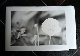
A few days ago I was setting up the enlarger to make some 9.5 x 12 prints from Kentmere 100 35mm film. That had some images of poppies made in the garden. All though they all turned out well. I had noticed, I was loosing about an inch or so off the side of the negative.

I started to speculate wouldn't it be nice to include that missing edge at the same ratio of enlargement without having to down size it to make it fit. This idea was going to be difficult to fulfill as my main sizes are 8 x 10 and 9.5 x 12. This left the 20 x 24 this maybe it's finest hour. 

After a certain point in time old paper starts to increase their latency. This means you need to start adding more exposure time (light ) to the paper to receive the same results you would get with the fresh stuff.

With paper this old you may as well chuck it in the bin. Yes! it is coming, if it was this article would be at an end. But! while I am processing anyway I may as well see if I can get any sort of image.


Where to start? a Segmented test print. Where you increase the amount of exposure at set times. The problem with this is you have no idea how many increments of light will be needed to arrive at the exposure. I short cut it by using the exposure time from the negative already set up using that exposure time as a starting point.

Fortunately the developer was fresh in that it had only half a dozen prints through it. To allow for the sluggish latency I would develop the print for two minutes. Twice normal for RC papers to give it a chance to produce tones.

Before we go any further we need to look at the negative I was using. It had been exposed to Foma 311 RC paper. It took 27 seconds at grade 3 with the lens set to F5.6. This would be the starting point then with one change the enlarger had to have the filter setting changed for multigrade 4.

After a little bit of contortionist cutting, the paper was in two bits of equal size well almost and the easel adjusted to allow for the new size, the paper was exposed. 

Surprisingly when I remove the paper from the processor after 2 mins there was a soft image, emboldened I increased the exposure to 30 secs. A slight increase but not enough. Time to get radical and doubled the light by opening the enlarging lens to F4.

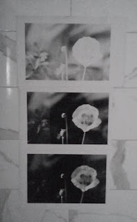
The print was darker again but not enough to get a good black, so I opened the lens to f 2.8 at 30 secs. Effectively four time the light from when I started. When the print came off of the processor this time it was nearly perfect. I did another print adding 15 sec burn to the highlighted poppy. Done.

I did consider pre-flashing the paper this is where you add light to the point just before recording a tone to overcome the latency. I explain how it is done in a previous article link at the bottom of the page. You will properly have to make time changes from part seconds to seconds in the case of old papers. A case of testing to see what works to get the right result. There is also double grade printing a link at the bottom of the page explains this method as well.

A note of caution what works well for one pack of paper may not for another keeping your grey matter on its toes. It will be the case that no matter what is done you will not get the result you are looking for it is at that point a decision needs to be made to bin it.

I am pleased that I had a go with this paper. It has introduced me to a new format size for 35mm printing. I feel it is more pleasurable to look at with that bit of extra width. A sort of shortened panoramic feel.

When the same image is compared with the Foma 311 version it has a slight warmth to it which could be down to its age, if anything this adds to it. Making the Foma composition a little clinical looking. It is a unintended consequence of mixing different papers and throws up a question about creative choice. Which I'm go to leave you with to ponder.


All the photographs were reproduced using a phone camera and edited in Photoshop.

The first four pictures were made using Ilford multigrade 4 pearl RC.

The fifth is on Foma 311 gloss RC.

Links 

Paper flashing

Paper flashing more examples

Double grade printing


Tuesday 25 December 2018

XP2 super is pulled in to the darkroom screaming


On the frontier of a new discovery in the darkroom A bit dramatic I know but that is how I felt. All rubbish, I'm not the first to travel this route. It is new ground for me and this time I have left the research alone.

Fotospeed RCVC paper

With no preconceived ideas as to what was going to happen. I'm free to experiment. The first and most noticeable problem is the colour of the film base. Will I be able to set the grade of paper I want?

 Before the film got anywhere near the darkroom I found my old Ilford multigrade filters and looked through them to see if the film base had a close relation. It is lighter in colour to filter number four in the set but will it interfere? I did try to duplicate the filter grade on my colour enlarger the closest I could get was what I set for grade three and that was darker.

Multigrade filters with XP2s film
To stop the speculation I contact printed all the film using white light at two seconds with the lens fully open. These are some of the best contact prints I have had, nicely toned and detailed. I was not expecting that!


The next thing to do was to scale it up to a print size in this case 8 x 10. I would do a segmented test print using white light and then set to grade three. I chose Fotospeeds RCVC to do the test on. (A much under rated paper ). I did the first print F8 for 4 sec's using white light and set grade three at F8 for seventeen sec's. 

HC 110 processed XP2s
 The results I received plays into my assertion that multigrade papers can produce well toned prints without filtration. That's not quite true in this case as the film bass is close to the shade of one of the multigrade filters. 


Here is a thought, if film base was the colour of a particular filter would all the negative on the film print at that grade? And would you need graded filters any more? There's something to ponder while you develop your prints. If you have any thoughts please share.


Where was I hum! Yes the results of course. The difference between the white light and grade 3 print? In short not a lot if you did not know which was which you would be hard pressed to tell but there is a subtle one it shows as an increase in the strength of tone and a slight uplift in contrast.
 
XP2s contact prints exposed
with 2 sec white light

I was expecting a difficult time in getting good results because of the colour of the film base. This is partly because of what others had suggested when they had a go at printing. In fact I have found so far it very easy to print the XP2s negatives. I think if anything the tint of the film base has enhanced the results.


This was the first graded print the
white light print
was slightly brighter
If we go back to when the film was exposed it was a very bright day with lots of contrast and if this had been a normal black and white film the contrast would have lead to a grade zero when being printed. Instead the prints have been at my normal grade three. Thinking on what others have said it leads me to believe that XP2s under represents contrast levels which would explain the flat looking prints when used normally. To counter this I would suggest using a harder filter grade and or Kentmere RC to lift the contrast to a better level.

Printed on Ilford
multigrade FB paper
Back in the darkroom getting sharp focus was difficult. The grain seen in the focus finder is very fine and the window of sharpness is very small unlike traditional film emulsions. What I mean by this is when turning the focus wheel on the enlarger the grain of the film sharpens If you keep turning it stays sharp for a few degrees of turn and then go's soft. With the XP2s it go's out of focus almost as soon as it is sharp.


 I did try other grades of filter to see if they worked they did but made the picture look muddy and very dark. Under normal circumstances I would interpret this as the  wrong grade being selected and or over exposed.  


In answer to my question Will I be able to set the grade of paper I want?
No! I am of the impression that the colour of the film base plays a part in the amount of contrast the paper displays. I have not really forced the issue because the level of contrast I'm getting is to my liking. But you may know differently in which case please share.


You maybe interested in this The first part of this post:


Sunday 28 January 2018

The photograph

The photograph is the positive result of a long journey from making the negative to the print. Once you get to the point of printing it starts another odyssey of creativity, along with another set of decisions as to what materials you are going use to produce those wonderful photographs.

Recently a photographer said he only uses the materials of his chosen manufacture to produces his images. His position is they know best so why make things difficult by using different products. At one time I was the same using paired paper and developer to produce prints. But with the death my father I'm questioning this approach; it has made me seriously think about the materials I choose to use. Why? Because life's too short for such restrictions and I've started to believe that the choice of materials you choose to use has a direct impact on the look of the final image and therefore it's style.

In today’s world of analogue photography there is not the vast array of papers there used to be. Light sensitive papers fall into three tonal types: neutral, cold and warm and come as resin coated and fibre base with a number of different finishes. Now-a-days the main stream papers are variable grade meaning you no longer need to stock a number of set grades of each type of paper you prefer to use. This has given greater freedom to stock a number of manufacturers paper types. For example I have stocks of Ilford, Foma, and Adox on the shelf in warm, cold and neutral tones. This has given greater creative latitude when it comes to exposing negatives, this has lead to less stringent light meter readings and less time trying to make the conditions fit the grades of your printing stock. I have in the past used a particular developer for my prints so it conveys a feeling on the subconscious level, for example, adding warmth when in fact the scene is cold. Is this not part of the creative process? For some it would seem not.

Analogue photography is all about the photograph. If you do not hand print your pictures you are missing out.

Accompanying pictures: 

All images scanned from photographs. The papers used in order of appearance, Kentmere VC select RC gloss, Ilford Multigrade 4 RC gloss, Fotospeed RC gloss, Foma 542 chamois FB gloss. 

Since writing this the wonderful Foma chamois has been discontinued.


Saturday 25 February 2017

Picture Post Eukobrom AC Developed photographs

Paper Kentmere RC gloss.
The images that appear in this gallery have been processed using Tetenals Eukobrom AC developer on a number of different papers.

I would like to thank Tetenal for there interest in and re-blogging of the first look post. It was a big surprise when they got intouch.

There is a new post on Eukobrom to be published not all good news.


Paper Fomatone  Chamois 542-11 matt


Paper Ilford FB gloss
Paper Fotospeed RC gloss

Paper Kentmere RC gloss

Paper Fomatone Chamois 542-11 matt


Technical Data:

Camera Bronica SQAi, lens 80mm, Film ilford FP4+ iso 125, Fomapan 100 iso 100, Negative size 120 6x6, Developed in Studional.

Scanned from paper size 9.5 x 12, paper used listed with each image.


Friday 17 February 2017

Double grade printing.


From time to time I find it strange the way events come together! for instance, I was in the darkroom working on some prints that I could not get the sky to burn in properly. There was nothing unusual in me burning in the sky, most of the photographs I produce have had the skies enhanced in some way. But this time I could not get it the way I wanted it.


The strangeness in this case was that a few days before, I was reading a thread on my favourite forum about how to deal with whited out skies when printing. I took part giving an account of my method of dealing with it. One of the other contributors suggested split grade printing. But when he described the process it is more akin to double grade printing - this is where you use another grade to bring out part of the image that will not burn in at the grade you are using.


All the circled images needed double grade printing.

The process:


The contact print in this case suggested that the stone work of the building and sky were under exposed when compared to the reflection. The segmented test print (grade 2) proved this by indicating that it may need to be burned in for an extra twenty seconds above base exposure of thirty seven seconds. Even with the extra light it did not make the difference. After a further print and forty seconds burn in, it still was not right. I decided to see if changing to a harder grade when burning in would make the difference.

With the discussion still fresh in my mind I opted to use the double grade method to see if it would solve the problem I was having. I normally would have used pre flashed paper but that would mean starting all over again with a pre-flashed test strip. I chose the simpler route of dialing in a harder grade, in this case 4, before burning in the sky and face of the building.

The red area indicates the over lap area of the mask.
Something to consider:

When using this method certain negatives can produce a grainier look to the picture which may not be to your liking and you need to be careful not to knock the masking frame when changing the settings and using the mask.

The burning in method:

It takes practice to get this method to look natural, which is easy to master when you have a nice defined area without things like buildings poking up above the horizon. A piece of card is needed to use as a mask. You do not need to use black card but if you have some all well and good. Otherwise any card will do, if one side is brighter than the other you should always make that side face the lens to reflect the light back. In my opinion you should make the mask smaller than the site that needs covering. Because the card is kept moving it will make up for the under size when used with an up and down motion. If you don't you can end up with a lighter shaded area a bit like an out line you would get if it was still. When you get it right it is very satisfying.

 Result:

I used forty seconds at grade four to burn in the building and sky. How did I know it would work? I further considered the segmented test print, took a calculated risk and listened to the little voice in the back of my head. In other words I went with the creative flow.


Basic outline for split grade printing.

Saturday 10 December 2016

What can Contact prints tell you.

I have written on this subject before outlining the advantages of making a contact print for your negatives. The subject has come to the fore because a recent example shows that the negatives are poorly exposed and possibly have a higher than normal amount of contrast.


 So where to start? With the sheet of negatives. The first thing you notice about them is that they are well developed with good tone and detail but on the dense side, meaning they could be over exposed / developed. Something that can sometimes be difficult to judge from the neg's only.
 
The contact print is saying that the negatives are well and truly over exposed and or over developed meaning that to get a balanced image is going to require a longer than normal exposure. It is also suggesting that the images are hard (a lot of contrast) How much will not become apparent until the segmented test print has been produced.


My normal exposure set up for the enlarger is F8 at grade 3 this is my datum point to which I judge how well I have exposed and developed the film. The first test print confirms that the negatives are very over exposed, requiring a second test because the results are so weak. I must admit that I was a bit blasé with my pinhole camera exposure times. This camera tends to bring the worst out in me when it comes to proper control but then it is all part of the fun.


I have already compensated for the longer exposure time by opening up the enlarging lens to F5.6 doubling the amount of light I would usually need. I also know that the contrast is higher than normal from a previous set of exposed photographs. It is to do with the Studional I used to develop the negatives in. A previous session showed that the softer grade 2 would give better results.


Without the contact print I would have spent much longer in the darkroom making test prints to find what the base exposure should be, if I had not been pre warned. It also indicated that the completely white looking skies would require a lot of burning in to bring the detail out shown on the negatives.


For me making a contact print ensures that I get the most out of my printing session. It allows me to preplan what I need to do to get the best out of each negative without wasting a lot paper and time. The later for me is always in short supply.


Technical data:

Zero pinhole multi format 120, tripod used, Film Fomapan 100, ISO 100, Developed in Studional, Printed on Ilford multigrade gloss RC 8 x 10, Developed in Tetenal Eukobrom 
AC.


Unintended double exposure.


Saturday 3 December 2016

Freestyle printing session


I don't know about you but sometimes I find the constraint of having to make a segmented test print to determine the right exposure for each negative tiresome. I sometimes feel that it interferes with the creative process. On these occasion in the darkroom I put myself to the test with what I call free printing. I can see some of you shaking your heads at such a notion. It is a way of pushing your instincts creatively. 

Let me lay out the rules of this creative freedom. I pick a random sleeve of negatives, run my eye over them to see what catches my attention. Load that negative into the enlarger and then make a half sheet test strip at five second intervals. This will be the only test strip of the session providing the starting point for each subsequent negative I opt to print. I give myself two attempts at getting the exposure right using my experience and knowledge (best guess) to refine it with dodging and burning. This is where your print technique is put to the test and your ability to choose negatives of the same density.
First print.
 

Into the darkroom. I have chosen a set of 35mm negatives that have a selection of landscapes I made while I was in the lake district and the one that took my eye was looking across the lake into the sun. As gooder place as any to start the printing session.


After adjustments

With this negative loaded I set up the enlarger as follows: the lens to F8 and the paper grade to three. These are the most common settings I use when printing. The paper used is silverproof matt. With the test strip made I look carefully at it to work out the overall exposure and how much more light may or may not be needed for a balanced print. 


The mountain into the sun image is the one I made the test strip for. Even so it proved difficult to get right. I chose to print overall at 32 seconds adding an extra 15 secs for the sky. This did not allow for the mountain slops on the left of the picture which needed less light to stop them completely blocking out. The burning in of the sky did not take into account the brighter area to the center right leaving it a bit blown out. So for the second print the mountain slops to the left were held back for -7 secs and the off center sky received a further +15 secs.

Before adjustments

After adjustments


The second negative chosen was the fence post into the sun. I already knew that overall this would require less light to print, the trick here would be by how much, after a bit of consideration I opted for 27 secs. Which worked well but I felt it needed even less. Overall the second print was exposed for 24.5 secs with an added 5 secs for the sky. Not much of a change, but the affect on the foreground was positive.


Before

After

Right first time no adjustments


The third negative is of the dog in the lake. I chose 25 seconds for this because the negative looked a bit dark indicating some over exposure. I was too bold with my exposure time as the print is a bit washed out with no sky. So I up it to 28 secs and added +28 for the sky. In cases where the sky is whited out I double the amount of light when burning in. Overall a much better picture.


The final image looking through the trees is a straight print, the overall time is 27 seconds. I'm happy with the print, yes I could adjust a couple of bits, but they would not add much to the overall look.

Free flow printing sessions are not always successful but it does free my mind especially if I'm having a bad time getting a picture the way I want it. 

Sunday 6 November 2016

Studional first use.

Negatives developed
in Studional.
The darkroom is beckoning again, with the death of my father the will or the inclination to do anything connected with film photography has been at a stand still. It is as though my creative energy has been knocked out of me. It was the childhood wonder I had in his fold out camera that peaked my interest in photography in the first place. Spurred on with the little camera he then gave me. Which was later given away.


The darkroom has suffered with my long absence. It is a dusty dirty hole in need of some maintenance. I have also neglected to replace used up materials: film developers, photo papers etc. etc. It has taken time getting things back into shape, for now I will have to make do with what I've got materials wise. Which just happens to be a fresh bottle of Studional.


This is A&Os formulation of the once dead developer. It is advertised as a fine grain, clean working general developer - that can be used in deep tanks?? - or single use. I have interpreted deep tank to mean batch development where a number of film can be processed from a single batch of diluted developer. It suggests dilutions of 1+15 to 1+30 for one shot use. So I am assuming the same for batch production.

Grain pattern produced by Studional on FP4+.
The colour cast represents printing grade three.

I have been told that this developer is akin to RO9s and can be treated in the same way. This is the first time I have used it so I will do as suggested - which is not my usual way of working - I tend to do what my instincts tell me; I must still be out of sorts!!


I have a number of rolls of 120 FP4+ and 35mm Fomapan 400 to process. Checking through the dilution chart it suggests a dilution for the above films as being 1+15 with a developing times of 3.5 and 6 minutes for the Foma. (Digital truths dev chart is a good place to go for dilutions and times.)


I have made up a litre of the developer at 1+15 and intend to use it as though it was RO9s that means on the day of dilution you can process 12 film of mixed formats in a litre with no time compensation. The developer is good for three months with compensation factors for how long the developer has been stored diluted. (Adjustments: 1-3 days 5%, 4-8 days 10%, 1-2 weeks 15%, 2 weeks to 3 months 20%.) I know it sounds a bit flaky but true, I have already tested this with RO9s so I know it works, with no degradation in the quality of the negatives. Like RO9s you will need to protect you hands when using it. It has a caustic bite, this is the second developer that I have experienced this with.


On the day of dilution I processed four films: Two FP4+ and two Fomapan 400 both were exposed at box speed. I developed the Foma for the suggested time and the FP4+ at 4 minutes. Using my standard agitation method: 12 inversion in the first min and then 4 each min after that. Short developing times like that of FP4+ always makes me feel there is something missing. I think it is because I'm used to using longer times. The results are clean and crisp with a good tonal separation. They also look to have more contrast than what I'm used to.

I didn't know at the time of making up the developer that it would take a month till I would use it again. This time with a couple of rolls of 120 FP4+ and Foma 100. In this case I added the 20% compensation. After the first set of neg's had been processed I checked them. No change in the tone or quality which was good news for those that followed. In all, the developer produced ten good sets of negatives before the three month suggested time period was up, without any noticeable changes to contrast etc.


I have contact printed all of the film processed in the Studional. Out of the hundred and seventy negatives only a couple show signs of air bells (bubble marks) which is not bad, I have experienced a lot worse. The contact prints were made on Ilford multigrade RC gloss, developed in Tetanal new Eukobrom AC.

Having printed some of the individual negatives I can confirm that there is an increase in contrast and that it has a fine grain structure. It has helped to produce some finely toned photographs. It has also helped me regain some of my creative spark that has been missing over the months. I cannot say the same for writing these articles I am still finding it difficult to get started.


Technical Data:

Bronica SQAi Hand held, Film FP4+ @ 125 ISO. Box speed, 120 format 6x6 negative, Printed on Ilford Multigrade gloss RC 10 x 8 @ grade 2 developed in Tetanal Eukobrom AC.


Saturday 23 May 2015

Contact prints why?

Contact sheets
The humble contact print is a very powerful tool when creating an enlarged photograph. It passes on a wealth of information in its imperfect way. It is not just a positive record (proof) of all the images on the film but a starting point for the perfect print.

Not everyone agrees that a contact print of your processed film is needed. Instead, they like to work straight from the negative. I do not have a problem with this approach except on a practical level you need a light source to view them. I use the contact print not only as a reference for all my negatives but as an indicator as to which images are going to be more of a challenge to print. It is not always possible to see this when looking at the negative.

Making a contact print using a sheet of
glass to keep the negatives flat and in
contact with the paper. 
It is not a case of one, (the negative) or the other, (the contact print) but both together. By using them in conjunction you have all the information you need about the image you are going to print leading to a more judicious use of your time in the darkroom and a greater likely hood of the first proof print being closer to what you had in mind as the final print. A couple of tweaks to the next print may fulfil your vision. 


35mm contact printer
Contact printing does not require an enlarger or any special equipment. A darkened room, a frosted light bulb suspended from the ceiling and a sheet of glass to keep the negative[s] in contact with the paper and flat. Edward Weston used this simple method for his prints. During the timed exposure he would dodge the image where necessary. Once this time had elapsed, he would burn in where he thought it was needed. This method can be a bit uncertain, as you cannot always see where you need to make the adjustments unlike that of the image projected by the enlarger. A number of large format photographers still use contact printing as a way of making their final print from their negatives.


120 format contact sheet.
 This indicates that the negatives on
 left sides are overexposed. 
 
When contact printing I use my enlarger set to white light, with the lens fully open. The projected light is greater in size than the 8 x 10 paper I'm contact printing with. For 35mm film I use a contact frame and for 120 format and above a pane of glass with a ground edge, so I do not cut my fingers.

There are varying opinions on whether you should set white light, use grade one or your preferred printing grade. I have always used white light with multigrade and varitone papers and yes it works very well. You get a full range of tones.
The enlarged image shows that this negative
would enlarge without adjustment.


Remember a contact print in its simplest form is a work in progress not the finish article. I have found that some of my negatives print better with white light than they do graded. At one time I used to produce all my enlargements with white light and was very happy with the out come. With experience came sophistication and now I use graded and split graded printing methods to get the best out of the negative.


You should do what you feel is best creatively for your negatives and not let others dissuade you from that path.