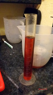
 |
| One open ,One untouched. |
I
have some good and bad news concerning Tetenal's Eukobrom AC. I
have been pushing the developer to find it's limits. Without knowing
where the edges are you cannot be sure that you are getting the
optimum usage.
The good news is that two litres of diluted developer at 1 to 9 stored in a slot processor will remain usable for up to six weeks. Obviously this will vary depending on your circumstances. Also as the developer gets older the solution becomes more brown. Along with this it imparts some of this colour to the photograph by producing a subtle chocolate brown warmth in this case with Kentmere select RC gloss. A paper I have been using alot.
 |
| Used and depleted |
The
bad news is, while I have been involved in seeing how long a working
solution will last, I forgot to mark the stock bottle with an 'opened
on date'!. As a result 800 mls of unused developer has been thrown
away. The first time I have had to do this ever!
I
discovered this 'error' at the start of a printing session. The
existing developer was tested for usability and found to be no longer
viable. So I made up a new batch to find that this was also depleted.
I was suspicious that the open bottle was off by the colour but made
up a new batch anyway. In the past with other traditional developers
the colour does not always indicate that it is exhausted. It took
time to find out for sure as the new developer was producing a very soft test image without any contrast. I was using Kentmere paper, not
known for being on the soft side and very quick to produce an image
when placed in the developer, seconds in fact. In this case it still
was not right after two minutes. After several attempts it was
dumped. Not impressed to say the least.
 |
Continence from open
bottle |
 |
| Test Prints from open bottle of Eukobrom AC |
Not
to worry I had a new unopened bottle. However on pouring the new
bottle into the measuring jug this was brown in colour as well. Not
the slight orange colour I was expecting. Now I was angry. I made up
a batch anyway and to my surprise I was met with a well developed
test image. Fully toned, great!
It
took over an hour to get to this point what with one thing and
another. My temper mellowed as each successive photograph left the
developer fully toned.
 |
Developer from fresh
bottle |
 |
Developer from
fresh bottle. |
 |
| Test print in fresh developer.. |
Will I use the developer again? I still have the best part of a litre left from a dodgy opened bottle that has an 'opened on date'. As long as the contents are viable I will use it again. As to re stocking it? Not sure? It is just as well I keep some of my old friends in stock.
I
did email Tetenal a long time ago to find out if they had any
suggestions as to why this should be the case but have had no answer,
I can share with you at the point of writing there is still no answer
on posting.
 |
| Printed on Kentmere RC gloss paper developed in Tetenal Eukobrom AC |
This post was first published in 2017 there has not been any response from Tetenal on my concerns to this date.
 Please
don't get me wrong! I started my printing journey with Ilfords
Multigrade developer, it still has a well earned place on my print
developer shelf. It sits along side a number of other manufacturers
toning developers. You need not stop here, for there is a range of
powdered developers to consider as well. The choice can be mind
boggling so it is a case of picking one that catches your eye and
giving it a try.
 I
did this with Moersch 6 blue and it has become a favorite. It has
been used with warm, natural and cool tone papers. It produces rich
blacks and the highlights have a hint of blueness to them. That's the
thing with toning developers they are subtle in their colour. It
opens up another way of communicating with the viewer. The thing with
these types of developer is the more tone you want the longer the
development time and the weaker the mix needs to be. The type of
paper being used also influences what sort of tone is produced.


