Pages

Tuesday 25 December 2018

XP2 super is pulled in to the darkroom screaming


On the frontier of a new discovery in the darkroom A bit dramatic I know but that is how I felt. All rubbish, I'm not the first to travel this route. It is new ground for me and this time I have left the research alone.

Fotospeed RCVC paper

With no preconceived ideas as to what was going to happen. I'm free to experiment. The first and most noticeable problem is the colour of the film base. Will I be able to set the grade of paper I want?

 Before the film got anywhere near the darkroom I found my old Ilford multigrade filters and looked through them to see if the film base had a close relation. It is lighter in colour to filter number four in the set but will it interfere? I did try to duplicate the filter grade on my colour enlarger the closest I could get was what I set for grade three and that was darker.

Multigrade filters with XP2s film
To stop the speculation I contact printed all the film using white light at two seconds with the lens fully open. These are some of the best contact prints I have had, nicely toned and detailed. I was not expecting that!


The next thing to do was to scale it up to a print size in this case 8 x 10. I would do a segmented test print using white light and then set to grade three. I chose Fotospeeds RCVC to do the test on. (A much under rated paper ). I did the first print F8 for 4 sec's using white light and set grade three at F8 for seventeen sec's. 

HC 110 processed XP2s
 The results I received plays into my assertion that multigrade papers can produce well toned prints without filtration. That's not quite true in this case as the film bass is close to the shade of one of the multigrade filters. 


Here is a thought, if film base was the colour of a particular filter would all the negative on the film print at that grade? And would you need graded filters any more? There's something to ponder while you develop your prints. If you have any thoughts please share.


Where was I hum! Yes the results of course. The difference between the white light and grade 3 print? In short not a lot if you did not know which was which you would be hard pressed to tell but there is a subtle one it shows as an increase in the strength of tone and a slight uplift in contrast.
 
XP2s contact prints exposed
with 2 sec white light

I was expecting a difficult time in getting good results because of the colour of the film base. This is partly because of what others had suggested when they had a go at printing. In fact I have found so far it very easy to print the XP2s negatives. I think if anything the tint of the film base has enhanced the results.


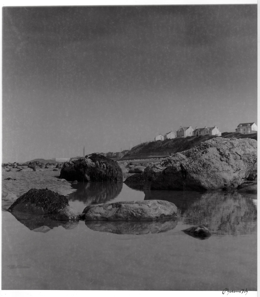
This was the first graded print the
white light print
was slightly brighter
If we go back to when the film was exposed it was a very bright day with lots of contrast and if this had been a normal black and white film the contrast would have lead to a grade zero when being printed. Instead the prints have been at my normal grade three. Thinking on what others have said it leads me to believe that XP2s under represents contrast levels which would explain the flat looking prints when used normally. To counter this I would suggest using a harder filter grade and or Kentmere RC to lift the contrast to a better level.

Printed on Ilford
multigrade FB paper
Back in the darkroom getting sharp focus was difficult. The grain seen in the focus finder is very fine and the window of sharpness is very small unlike traditional film emulsions. What I mean by this is when turning the focus wheel on the enlarger the grain of the film sharpens If you keep turning it stays sharp for a few degrees of turn and then go's soft. With the XP2s it go's out of focus almost as soon as it is sharp.


 I did try other grades of filter to see if they worked they did but made the picture look muddy and very dark. Under normal circumstances I would interpret this as the  wrong grade being selected and or over exposed.  


In answer to my question Will I be able to set the grade of paper I want?
No! I am of the impression that the colour of the film base plays a part in the amount of contrast the paper displays. I have not really forced the issue because the level of contrast I'm getting is to my liking. But you may know differently in which case please share.


You maybe interested in this The first part of this post:


Monday 24 December 2018

Strobisam

This article was written a long time ago and is from another version of a blog by photomi7ch. The images that were part of this article have long disappeared.

Strobisam

A modern way of describing off camera flash, an art in itself. Those of you who know me well are aware that I cannot abide camera flash and try to avoid it at all costs.

What I'm going to tell you should be kept between us! I own a flash gun or two and will use off camera flash to add punch to some of my pictures if I think they need it. Shock, horror! remember keep it between us!


I realised the potential of off camera flash before I purchased my first unit. So researched which make and type met my requirements. Then there was no stopping me I always had a flash in my bag, along with elastic bands, cardboard, silver foil and anything else I could use to help achieve the light I wanted. My camera bag looked like a waste site. Looking back, I'm surprised I could get my cameras and lenses in the bag let alone find them when I needed them or for that matter lift the bag and hike the miles I did. Now days it is much easier, you can buy the attachments needed to get the right lighting effects which means a tidy lighter camera bag.


Not all of us can afford to buy all these new ad Ons and part of the fun is making your own to keep the cost down. Not only that, when an improvised reflector or snoot works it adds a bit of kudos to the final picture. Which brings me neatly on to the strobist blog a great place to go if you are new or need ideas, there are videos and articles that explain the basics. Also, a Flickr group that allows you to ask questions and get advice.

The days of toting around a camera bag with flash and goodies are long gone. You don't need loads of kit to make great images.


Sunday 23 December 2018

XP2 super meets Zero pinhole camera and then mugged by Kodak HC110

All of this film is beyond it's best
before date.

They say that fact is stranger than fiction - but this is not fiction! I have processed XP2 super 400 in Kodak's HC 110. It has produced some wonderfully smooth toned negatives with just the right amount of contrast. I really will not know how good these negatives are until they are darkroom printed.


This adventure started with my pinhole camera and the crazy idea that I would like to use the out of date XP2s sitting in my film cupboard. I have used this film in the past and been completely under whelmed by the flat looking photographs I received back from the lab. That is why I think I am being crazy!


So for the first time I am going to see what others have done and said about this film. I started with a bit of research something I do not usually do. When using a film product for the first time I like to approach it fresh without all the hurly burly from other people.


HC 110
Not to be mistake for golden syrup.
 
First I should explain that XP2 super is a chromogenic black and white film designed to be processed using the C41 process for colour film. Super is the updated version of the original XP2 first released in 1981.


With a quick search a number of references came up, the first one I went to was the online photographer blog. Written by Mike Johnston. I took two things away from this blog. First was how to get the best from the film in different light if you are using the C41 process. He suggests altering the ISO depending on the lighting conditions as the film can become very contrasty. Not from my experience.


  • For regular shooting in normal lighting ISO 200
  • For shooting in extremely bright and or contrasty light ISO 100
  • For shooting in low and low contrast lighting indoor or out ISO 400
  • He does not recommend using it at ISO 800

The other bit of information that took my eye but was not part of the post was about cross processing using the monochrome chemicals. This made me sit up and take note. I like the idea of using black and white material to process and print the film because I could do it in my darkroom without a costly upgrade.

I found the write up about using black and white chemistry on the Ilford photo web site. It is very informative and took some time to read. The author Chris Moss has not only developed XP2s in HC 110 but has also used Rodinal and Ilfotec HC. He has posted a lot of images to back all his work up.

HC 110 in syringes
It became apparent that he preferred HC 110 as most of the work described is devoted to this developer. It was at this point I decided to use HC 110 myself so I could in part test his results and cut out a lot of trial and error on my own account - a short cut so to speak. I was however disappointed to find that all his negatives had been scanned and not printed in the darkroom. The short cut in the beginning means I will have more time to experiment in the darkroom.

Lastly before I move onto my results it is worth mentioning Erik Gouldproject web site and in-particular his article on using HC 110 to control contrast by varying the dilution of the developer. This is mainly in response to Mike's assertion that XP2s can get very contrasty in certain situations. Most of this he relates to the C41 processed negatives he has produced. This could be the case for monochrome work.


Lets just check those setting again.
What have I gotten myself into! this was going to be a straight forward article about using XP2s and my pinhole camera. I'm pleased to say we are now getting on with the photography. The good thing about it is that I will be able to take part in world pinhole Day for the first time.

 I was able to go out over a number of days with my Zero that included world pinhole day to make the images. The sun was out which made a change from the dullness we had been experiencing, but it still had a bite.

I used three rolls of XP2s that I rated at 100 ISO I did this because it was a bright day and I wanted exposures that were seconds long rather than part seconds that a faster ISO would have produced. It also occurred to me after exposing a roll of delta 100 that I could do a comparison between the two films. In most cases it took about eight seconds for each exposure or round about as I can be quite cavalier when it comes to closing the shutter. This does lead to over exposing the film, something I should take in hand because I end up with longer printing times in the darkroom due to the density of the negatives.


XP2 S 400 negatives this shows
the colour of the neg base.

 It is the first time I have experienced scepticism and anticipation in relation to the results. A bit of an April fool feeling, no matter what happens I have a plan B or do I?


Right! I loaded the first roll into the tank. Developed it for 5 mins as suggested being a first for me, I develop one film at a time so I can adjust the dev time if needed. I used the HC 110 at a dilution of 1+49. Woe! this stuff is so concentrated it is like syrup. I was warned, which means using a normal graduated measure is out. You will need to use syringe/s to get the right amount of HC 110 out of the bottle if you are not going to end up with sticky fingers etc everywhere. They should be marked out in mls and part mls as the 49 works out at 12.3 mls in 600 mls of water. I wanted it to be the exact amount that was used.

Please note: that this article was written before Kodak changed the formulation of HC110 to make it easier to pour. This makes certain bit of this post superfluous but does not take away from the overall results. 


Contact print. 2 sec using white light.
When it came to processing the film I kept to my standard method 12 inversion for the first 30 seconds and then four inversion every minute there after. the stop was for two minutes with the same inversion count as the developer. I did the same for the fix, fixing for 5 mins and then checking to see if the film base had cleared. I did this partly because there can be an issue with under fixing if the fix is old which mine was having been used for five previous film. When I looked the base appeared a little foggy so I put it back in for a further two minutes.

While I was checking the film base I was relieved and pleased to see the tell tail squares that images were there. I now had the unspooled dripping wet film in my hand. To be presented with some wonderfully toned negatives on a pinkish magenta film base, was something I had not been prepared for. What wonders are to be had in the darkroom! Let the fun begin!? 

I recently exposed and developed some XP2s that is ten years out of best before date. There is an issue with fixing, you may find that after ten minutes of fixing that the base is still quite white looking  and has not cleared.  It is a normal situation that will clear once the film has been washed and dried.   


If you are interested The second part of this post:


Saturday 22 December 2018

Recall volume 2


There is a commotion in the hallway as the dogs clammer to get traction on the stone floor as they race to be first to the door. Ah! It must be the postman. There he is waiting to hand me the package containing my next copy of Recall. I thank him and head in.

With the package in hand I make my way to the office. There is a tinge of excitement as the packet is torn open. With bated breath I slowly pull the magazine from it's cardboard surround. Will it or wont it be as good as the last one. First impression suggest it is!


I remove it from the rapper, wow! Again the reproduction is wonderful it has caught the subtle reflections of light that were in the original photographs of the high rise blocks. There is a slight mistake that I missed, this was due to a software update that unsettled the original layout of the images but really not worth mentioning in detail.

Although I have set up a number of custom templates, do not take it for granted that there will render identical to the last issue without being carefully checked. Something I will do for the next volume. It is a case of getting used to the software and getting to grips with a method that allows things to flow. Once this happens then I think the mistakes will disappear.


I have decided not to release a digital copy as it defeats the idea of the magazine. Which is to share nicely printed pictures that could be framed and put on the wall.


I have a very small number of signed and numbed copies for anyone who maybe interested. You can only purchase them from me direct. If not you can buy direct from the site.

These links go straight to a blurb link that shows more of the content:


Friday 21 December 2018

Conversations


I have just finished reading the interview with Josef Koudelka. The only Czech person to document the soviet invasion of Czechoslovakia and Prague in particular. A defining moment in his life and career. A fitting point to introduce to you Apertures volume on their collection of published conversations.

Like many of you I am familiar with Josef Koudelka's images of this period but do not know much, if anything, about the man behind the lens. Of the sixty nine names that appear on the cover very few of them jump off the page as people I have read about and know well. There are some who I have heard of from others but a greater portion I have no knowledge of at all.


I read a very small review of this book in black and white photography mag that peaked my interest and the fact that it was a collection of interviews - a format that I have enjoyed reading in the past and prefer to televised versions. To be able to kick back with a cup of tea in a free moment and allow what is being discussed fully occupy your attention is a great way to understand fully what is going on.

There are no images in this book to distract you from what is being said. A bold move by Aperture. I sometimes feel that when I'm reading articles that are interspersed with pictures that they tend to take a back seat to the point of not being noticed. I know this is true in my case as I can revisit books and magazines and have no recollection of the accompanying images it is as though I am coming to them again for the first time.


I have discovered I do not like pre views of anything. I like to have an open mind on what is about to pass in front of my eyes and lodge in my brain - a bit like life it's self! Likewise, this book has introduced me to a lot of things and opinions I had not considered. I have no doubt that at some point in my photograph making some of the things I have read will show themselves in my images.

I am methodical in the way I read -I start at the front and work through. I am about two thirds through this five hundred odd page book which gives you some idea of it's size - not an easy book to stuff in your pocket to read on the train, bus or plane.

The conversations vary in length, some more fascinating than others, all based on visual expression. I am enjoying the odd moments of time I have spent with this book this year. I will go as far as to say if you are a photographer you should have a copy of this on your shelf and if a person from Aperture reads this you should do an companioning volume on all the images that went with the interviews.

Sunday 9 September 2018

Delta 100 and the lens-less camera


This is not the first time I have mentioned sharpness when it comes to pinhole photography. I know! not something you associate with the dream like quality of the images it produces. It is part of the reason that draws me to using a pinhole camera but it does not stop me speculating whether a T grain film would enhance the detail and therefore increase the sharpness.


I have already informally checked out the idea that Rodinal/RO9 could go some way to increasing sharpness which was done some time ago. (if your interested in that article I'll post a link at the end) The results did confirm that there was something in my observations. I will reiterate that the sharpness increase will not rival that of a lensed camera.


Delta 100 @100iso developed in RO9
 I did find that PMK Pyro developed negatives, when printed looked softer to the pictures produced from negatives processed in Rodinal/RO9 in a very subtle way. This then lead me on to thinking would T grain film with it's enhanced sharpness show a difference when used with a pinhole camera. Better still would it get a double boost when combined with Rodinal/RO9 developer?

 
Contact print on Fotospeed RCVC
So is there a difference? Yes a  noticeable one it has surprised me the level of increase. I'm not sure how much is down to the film alone because the film was developed in Rodinal/RO9. I suspect that most of it is from the films T grain and the developer has just enhanced the equation. 


What do I mean by an increase of sharpness - it shows it's self with a better defining of the details across all areas but still maintains that softness you expect from lens-less images. 


All the above were printed on Fotospeed RCVC paper developed in Ilford multigrade 

Link to older post on sharpness

Saturday 25 August 2018

Cartier Bresson collected interviews

 This is a wonderful pocket size book that you can dip into anytime. The page colour is not the standard bright white but a gentle off white which is quite resting for the eyes while you read it.

It is laid out in interview/ conversation style, each chapter is a discussion with questions in bold type and answers. Making it easy to put down and pick up without loosing the thread. I have read this book three times in a row it is that interesting.


This is the first time since the interviews were first published that they have been translated from French and put into one book. The book covers twelve interviews from 1951 – 1998. He talks about his passion for books and art about being a prisoner of war, travelling to the far east and setting up Magnum.


I have really enjoyed reading the interviews I was not sure of the format before hand but have discovered you take in far more and analyse what has been said far better than if I had listened.

Published by Aperture.

Friday 24 August 2018

Zone System really


Love it or hate it Ansel Adams zone system has become the cornerstone of film exposure and printing that a lot of people cannot get their head round. I was one of those people until I made a point of sitting down many years back with a copy of what he actually wrote.

 It is important to stress that when reading his method on the zone system that it comes from the source and that now a days is his volume on the Negative. This is the best place to start your understanding of the process. How do I know this? I read an abridged version of The Camera, The Negative and The Print. To my amazement some of the important parts of the method were left out which made it impossible to understand.


 It was a friends encouragement that I obtain all three volumes and if I did It would improve my understanding of the relationship between the camera and the final print. He was not wrong. I ended up reading all three from cover to cover. I must admit reading the bit on the zone system left me cold. I was none the wiser from this first read. I speculated that I was producing nicely exposed negatives so what was the point.
A year or so later I started to see a number of references to the Zone system on the internet. Some condoning it and other condemning it. This reignited my curiosity in trying to understand it; so I made a loose leaf copy that I carried around with me so I could read it whenever I got the chance and make notes.
I cannot remember how many times I re read it or how many notes I made to remind me what I did not understand and how that fitted in with the rest but all of a sudden it made sense. I could work out how it related to what the light meter was telling me.


It made a difference to the way I metered and exposed the film it also settled down my sometimes erratic results. I noticed that the negatives started to be more consistent in there density which transferred to the darkroom. The number of segmented test prints reduced across a series of images on the same film.

It has been more than a decade since I set out to understand the Zone system. It will always be there in the background of my mind jumping to the fore when I have a particularly difficultly scene to meter. In the main, I use a sort of high bred method that gives me the style of negatives I'm looking for.
All I'm saying is a better understanding of where different tones and textures appear on the tonal scale in relation to the exposure data can only lead to better more consistent results.


Tuesday 14 August 2018

Be noticed

How often do you review your images before you edit and or print them? There is a well kept secret among film photographers. The photo board or should I say the noticeboard - and yes they do get noticed.

On it I put all my new contact sheets and recently printed images. It is placed across the room from my computer and put there on purpose, allowing me to view the sheets and prints often, in those moments where I need a break from looking at the screen. It is a good reviver and helps to formulate how and which images to print. So when I take the negatives into the darkroom, things run more smoothly. 


I test whether or not the way it is printed and the paper used is right by putting the photograph on the board. Leaving it there for about three weeks or more. It also gives the print time to mature especially if I have used an FB paper. I have found that some of the fainter details show themselves when the print completely dries out. Along with any spotting that maybe needed. If at the end of this time I'm not compelled to reprint it. It becomes a print I'm happy to reproduce for sale.

I also use the noticeboard for editing sets of prints. This is a collaborative thing where anyone can move the order about or remove an image if they do not think it works. When this happens a discussion about the way the story should be told ensues, this a great way of getting the run of the pictures right.

Saturday 9 June 2018

Out for a stroll with the Zero


It is always a joy to be out with the Pinhole camera. But it must be a strange sight to behold as I walk up the street. A little brown box attached to what could be construed as a big black stick (tripod). On this occasion it was a lovely bright day with a biting cold wind; I had not appreciated just how cold it was until I had been standing about making the first image.


As I strolled around the local lakes I took warmth from the brilliant sunshine and the anticipation of some interesting image making. By the time I was half a dozen pictures in I had forgotten how cold I was. I think the cold must have gotten to me as I could not remember what the reciprocity factor should be. Times 2 up five seconds and times 5 from then on. Dam and I had left my note book behind with the reminders in. Oh well I'm not going back.


from T max negative

This walk is turning to a bit of a jokers holiday which had started before I had even left the house. My Zero is a multi format camera Just before I loaded the film I checked to see where the dividers were and in my mind it was set to 6x6 I loaded the film and used the centre red window to view the frame count. I should explain there are three for the different sizes of negative. Later that day I had the chance to develop the film only to find it was set to 6 x 4.5 – ehh! Fortunately the second film was only part way through so rectified it by using the top window for the next days images.


The wind was that strong it was producing lots of fine ripples across the water. I was not quit sure how this would look in the final images not having made many photos of water with this camera. It just go's to show how cold it was, on the eastern side of the lake I found a lot of glass thick ice being smashed up on the shore. This brought back how cold I was feeling. Time to get back, to a home made slow cooked beef Currie that should be bubbling away by now.


Contact print at 2 seconds
the print is
also showing signs
of exhausted fix.
 
Just before I left the house the following day I filled my pocket with a mix of film from different manufacturers; I do not usually do this but so what! it was an off the cuff decision to go out picture making so why not mix it up completely! The previous day I had already loaded Kodak's T Max 400 which I thought might be a bit of a gamble seeing how bright it was, just as well I did, as I messed up the exposure completely. On subsequent trips I loaded Ilford's delta 100 and Fomapan 100 which is my fav film for the Zero. The others were first time use and this time I got the exposure right.

How badly the T Max was exposed showed it self when I contact printed the negatives. I had to re do it at 5 sec's instead of my usual 2, enlarging lens fully open with white light (with no grade filters set). The negatives when looked at showed full detail. The contact print indicated that the enlargement were going to need long exposures and a lot of dodging to get them the way I wanted.

From Fomapan 100 negative

I have developed all my negatives in Adox version of Rodinal. I use 1+50 for the time required. I have to keep reminding myself that this developer has a high acutance and therefore a lot more contrast. In some cases overly so. I had in mind to use Kentmere RC gloss but changed to Footspeed's RC gloss that has a more normal look. If I had kept to the original route they would have had super contrast. As it was, I had to drop the filtration for printing down to 0 from my normal grade 3 . With the contrast sorted it was time for the exposures. With the segmented test print in the holding tray the fun really started. As an example one print had a base exposure of twenty seconds but then needed an extra 40 seconds on top of that for the sky and some of the lake. Others longer.

From Ilford delta 100 negative.
I had a good time in the darkroom even though the printing sessions were challenging the prints came out a lot better than expected. They have a lot of atmosphere to them that I'm really pleased about. Some of the photographs show that there is ice on the lake in places. I was not sure if that would show up but it has in a couple of the images.


Friday 13 April 2018

Recall magazine

I have been looking for a way to do justice to a series of photographs as a collection. I have shared some of them on the blog as a picture post called Tenth Floor. To be honest I have not really been satisfied with this method. It is great that they can be viewed as a set but it does not convey what they are like as photographs in the real world.

Having scanned them and then adjusted them in Photoshop to get them as close to the original, this still does not do them justice. I had thought about putting them in a book but it's an expensive way of putting ten pictures together as a series, so I looked at a magazine format which is quite an inexpensive way of printing a collection.

I decided to test the idea out with blurb. I have to say up front I am not a fan of the online print service since they screwed up a wedding book I got involved in some years ago.

Anyway having down loaded the updated software I set about putting the magazine together. It was good to see that the standard length was twenty pages - just right for my ten image project, giving me just enough space to add a few words of intro and some tec stuff at the end.

Not having produced anything book wise for a while, I had forgotten how involved it is just to get a basic structure together. For instance, what paper, font, title, how many images to a page the list go's on! The picture issue was easy to solve – one per page. The font was a bit more difficult, I wanted the theme to convey a type of note book look so I chose a font that looked like hand writing and easy to read.

The paper was quite easy in that you only had two choices. I plump for the better quality, I wanted the images to look like the resin coated paper that the original photographs had been made on. The title took a lot longer than anticipated and was suggested by the blogs editor.

Now that all the the bibs and bobs had been ironed out I could save the templates for the next issue. I expected it to be easy to produce the next issue but it is not! I maybe missing something in the workflow from one issue to the next we shall see.

The moment of truth came a week or so later. when a very thin cardboard package arrived. I was a little apprehensive when opening it. I hope this was going to be a lot better than the last package I had from blurb. OK WOW! it has well and truly exceeded my expectations it is a lovely thing to behold the gloss paper complemented the prints so much so they could have been the original photographs. In fact they could be cut out and framed. High praise I know but when it is right it is right - well done Blurb!

Would I recommend them? NO. A lot more water will have to pass under the bridge before I even consider it. A good start though.

The plan was to get one out a month this has not happened. Shortly after this article I was very ill, it took a long time to get passed. I did produce a second volume sometime later. 

So if you are interested in a copy here is the link and here is the link to the blog post Tenth Floor that this volume is based on.


If you would like a copy of the Magazine click on the link below.
http://www.blurb.co.uk/b/8533877-recall-volume-1

Saturday 3 February 2018

Kiroku by Dadio Moriyama.

I was flicking through some book reviews, when I came across one about Daido Moriyama's new book 'Record' known as Kiroku in Japanese. It is the collection of the first 30 issues of his personal magazine dating back to 1970s. Basically it chronicles his image making and some thoughts over the time period.

After reading the revue I had an irresistible feeling that I should obtain a copy. Although I am interested in Japanese photography I cannot say I know anything about Moriyama's work apart from he is a street photographer, which has a strong appeal.

 With a copy of Record in my hand and weight being the measure of quality, this is in the five star category. When you slide the book out of it's slip case you are presented with black edged pages and flush black edge hard cover something I have not seen before. This in itself brings a drama to what is to follow. 


When you open the book you are presented with silky smooth gloss white pages that keeps you in suspense as Mark Holborn introduces you to Daido Moriyama and sets the stage for the images to come. 

Wow! And what a shock they are! pulling no punches in their very high contrast look making full use of the term black and white. It takes time for your eyes to adjust to the rich black, making it difficult to see what the images are about. This is partly because these images are made on film at night without the use of flash making them very grainy. This graininess has been translated to the gloss pages by the printing technique making the pages gritty to the touch and adding a textural impact to the pictures.

He does not just use monochrome film there are some magazines in colour where he plays with the vibrancy of the colour. 


For a book that I decided to obtain on a whim, I have been very impressed by the images within. Yes the blackness, odd angles and graininess of the images are an assault on your sensibility's but that is what makes his work different.

It is a book to be enjoyed at leisure over many days and not all at once.