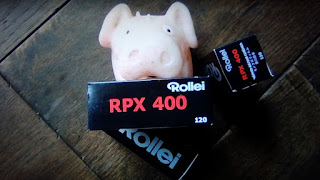
I
must admit that Rollei’s 120 RPX 400 was not on my list of film to
use. Until, that is, an unexpected package was handed to me by
the postman. I usually tend not to use film rated at 400 ISO, as it
is usually too fast for the weather I prefer to make images in -
bright days with cloud and to a certain extent, warm.
I
did ask a question on the forum (FADU) and was advised that the film
can be grainy. With this in mind, my thoughts turned to which
developer I should use. HC 110 seems to fit the bill, producing a fine
grain and sharp images. The problem with using a new make of film is
that any choices you make towards processing are all down to past
experience and gut feeling. The Rollei retro and R 3 (the latter no
longer made) I have used in the past have always produced some
wonderful negatives developed in ID11. What’s different about this
one?
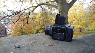
With
the developer chosen, all I had to do was load the film into my
Bronica SQAi with 250 mm lens, set 400 ISO and wait, wait and wait for
a break in the weather. It finally did, with some wicked, bright
days.
Fortunately
I had access to an ancient wood in need of some TLC. The piercing sun
presented some great interlaced shadows to play with and a look of
dereliction. The four of us spent an hour or so going this way and
that looking for interesting shapes, angles, plays of light and dark.
A good test of the film’s capability. I tend to take my time lining
up an image and, once done, I move on, making each frame count. I
know that some people make a back up shot in case the original is
damaged in some way. Others bracket above and below the light meter
reading they settle on. My counter argument to this is that when
using the Bronica SQAi, you only have twelve frames. I accept that I
do not always get the light reading spot on with it, which just makes
things interesting when printing in the darkroom. Oh! If you are
scanning the negs, it won’t matter anyway.

Some
days later, the film is loaded in the developing tank and it’s time
to process it in HC 110 diluted 1 to 39 for a suggested six minutes.
There is always a little apprehension when developing a new film for
the first time, wondering if the time will be long enough. As it
turned out, there was a nice set of well toned negatives hanging up
to dry. Now a bit of impatience sets in while I wait for them to dry
- the burning question being how big the grain will be?
24
hours later, the negatives have been cut and sleeved, but not all is
well. I have noticed on a number of the negatives that there is a
darkened area - something I glimpsed while making one of the
pictures. My Bronica 250 mm lens had sustained some damage along the
front edge that I should have dealt with by blacking it out. This led
to a number of the negatives having a flare of light across them. How
bad would be revealed when I print them in the darkroom.

The
following is the official line on Rollei RPX 400s capabilities -
Panchromatic black and white negative film, 400 ISO with standard
development, fine grain and sharpness, broad tonality and contrast
range. It is forgiving in that it has a broad latitude of exposure,
making it a good choice for push pull development. It’s
Panchromatic sensitivity is from 360-660 nm at 2850 k. You will need to
bear in mind that this information was sourced after I started the
developing process. I tend to do this so I can form my own opinion on
what I’m presented with.
Having
removed the cobwebs from the darkroom, it is time to fill the print
processor with fresh chemicals and a holding tray with water. The
first exposure will be to make a contact print of all the negatives -
this will show how many and to what extent the light flare has
interfered.
It
is disappointing to see that the light damage has touched nearly all
the negatives in some way, but never mind - my cropping skills will
need to be at their best here. One of the things I have noticed over
the years is never to dismiss a set of negatives just because they
have not turned out perfectly. It can mean that you produce something
more creative than you had in mind in the first place. Serendipity
can be a good friend.
Looking
at the contact print, it suggested that the negatives could be
printed at grade 2 or 3. With further consideration, I opted for
grade three because I thought I would get better separation of the
tones. To check my decision I would do a second print at grade 2.
I
chose to use Ilford multigrade paper and developer - the latter, when
fresh, produces some really crisp, rich blacks at the right grade. I
set the paper easel to 8 x 10, the enlarging lens to F8 and the
filtration to grade 3. With the negative in place, I turned on the
test light and used the focus finder to make sure the focus was
sharp. Trying to get sharp focus took a bit of time as the grain was
very small, much to my amazement.
I
always time paper development. It is a way of keeping an eye on how
exhausted the developer is becoming. It is obvious, looking at the
segmented test print, that the negative is on the thin side and my
choice of F8 was a good first step.
As
I look at the test print, it is suggesting that 10 to 15 seconds
should produce a really good photograph. So I opt for 12 seconds. As
I pull the print from the developer ready for the stop, it looks as
though I have over exposed. Disappointing maybe, but you should not
make quick judgements under red light conditions.
As
I pull the picture from the fix, I turn the room light on. I’m
presented with a crisp, high contrast print with some very defined
smooth tones. Wow! WOW! It stopped me in my tracks for a bit as I
took in the view. Shame about the light pollution, but I can crop
that out.
The
next print was exposed at grade two for 18 seconds and has a
completely different feel to it - again I was impressed. Next, I
enlarged the negative to 10 x 20, printing part of it on 8 x 10 paper to
see what grain it would produce. None that I could see.
I
have printed a number of the negatives and have been impressed with
each of them. I’m not sure why I do not use Rollei film more often.
It has a look and feel that I really like - I think some more rolls
will be on the cards. Please try this film. You will not be
disappointed.
This article is the copyright of Mitch Fusco all rights reserved