Pages

Showing posts with label magazine. Show all posts

Saturday 22 December 2018

Recall volume 2


There is a commotion in the hallway as the dogs clammer to get traction on the stone floor as they race to be first to the door. Ah! It must be the postman. There he is waiting to hand me the package containing my next copy of Recall. I thank him and head in.

With the package in hand I make my way to the office. There is a tinge of excitement as the packet is torn open. With bated breath I slowly pull the magazine from it's cardboard surround. Will it or wont it be as good as the last one. First impression suggest it is!
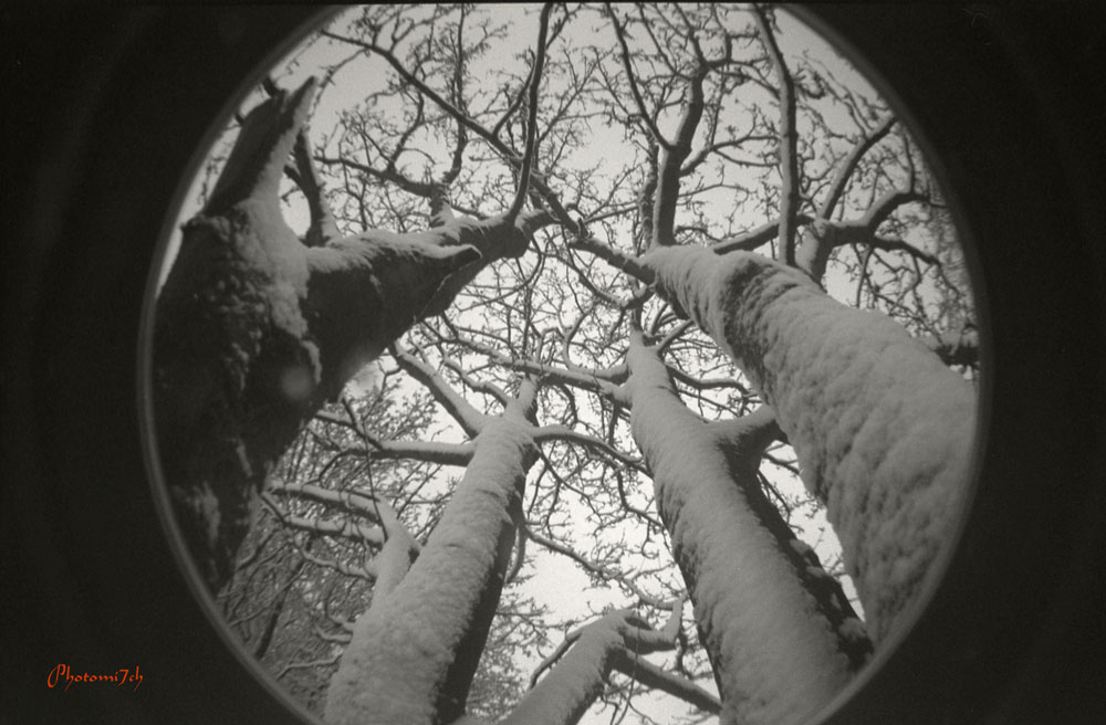


I remove it from the rapper, wow! Again the reproduction is wonderful it has caught the subtle reflections of light that were in the original photographs of the high rise blocks. There is a slight mistake that I missed, this was due to a software update that unsettled the original layout of the images but really not worth mentioning in detail.

Although I have set up a number of custom templates, do not take it for granted that there will render identical to the last issue without being carefully checked. Something I will do for the next volume. It is a case of getting used to the software and getting to grips with a method that allows things to flow. Once this happens then I think the mistakes will disappear.


I have decided not to release a digital copy as it defeats the idea of the magazine. Which is to share nicely printed pictures that could be framed and put on the wall.


I have a very small number of signed and numbed copies for anyone who maybe interested. You can only purchase them from me direct. If not you can buy direct from the site.

These links go straight to a blurb link that shows more of the content:


Tuesday 14 August 2018

Be noticed

How often do you review your images before you edit and or print them? There is a well kept secret among film photographers. The photo board or should I say the noticeboard - and yes they do get noticed.

On it I put all my new contact sheets and recently printed images. It is placed across the room from my computer and put there on purpose, allowing me to view the sheets and prints often, in those moments where I need a break from looking at the screen. It is a good reviver and helps to formulate how and which images to print. So when I take the negatives into the darkroom, things run more smoothly. 


I test whether or not the way it is printed and the paper used is right by putting the photograph on the board. Leaving it there for about three weeks or more. It also gives the print time to mature especially if I have used an FB paper. I have found that some of the fainter details show themselves when the print completely dries out. Along with any spotting that maybe needed. If at the end of this time I'm not compelled to reprint it. It becomes a print I'm happy to reproduce for sale.

I also use the noticeboard for editing sets of prints. This is a collaborative thing where anyone can move the order about or remove an image if they do not think it works. When this happens a discussion about the way the story should be told ensues, this a great way of getting the run of the pictures right.

Friday 13 April 2018

Recall magazine

I have been looking for a way to do justice to a series of photographs as a collection. I have shared some of them on the blog as a picture post called Tenth Floor. To be honest I have not really been satisfied with this method. It is great that they can be viewed as a set but it does not convey what they are like as photographs in the real world.

Having scanned them and then adjusted them in Photoshop to get them as close to the original, this still does not do them justice. I had thought about putting them in a book but it's an expensive way of putting ten pictures together as a series, so I looked at a magazine format which is quite an inexpensive way of printing a collection.

I decided to test the idea out with blurb. I have to say up front I am not a fan of the online print service since they screwed up a wedding book I got involved in some years ago.

Anyway having down loaded the updated software I set about putting the magazine together. It was good to see that the standard length was twenty pages - just right for my ten image project, giving me just enough space to add a few words of intro and some tec stuff at the end.

Not having produced anything book wise for a while, I had forgotten how involved it is just to get a basic structure together. For instance, what paper, font, title, how many images to a page the list go's on! The picture issue was easy to solve – one per page. The font was a bit more difficult, I wanted the theme to convey a type of note book look so I chose a font that looked like hand writing and easy to read.

The paper was quite easy in that you only had two choices. I plump for the better quality, I wanted the images to look like the resin coated paper that the original photographs had been made on. The title took a lot longer than anticipated and was suggested by the blogs editor.

Now that all the the bibs and bobs had been ironed out I could save the templates for the next issue. I expected it to be easy to produce the next issue but it is not! I maybe missing something in the workflow from one issue to the next we shall see.

The moment of truth came a week or so later. when a very thin cardboard package arrived. I was a little apprehensive when opening it. I hope this was going to be a lot better than the last package I had from blurb. OK WOW! it has well and truly exceeded my expectations it is a lovely thing to behold the gloss paper complemented the prints so much so they could have been the original photographs. In fact they could be cut out and framed. High praise I know but when it is right it is right - well done Blurb!

Would I recommend them? NO. A lot more water will have to pass under the bridge before I even consider it. A good start though.

The plan was to get one out a month this has not happened. Shortly after this article I was very ill, it took a long time to get passed. I did produce a second volume sometime later. 

So if you are interested in a copy here is the link and here is the link to the blog post Tenth Floor that this volume is based on.


If you would like a copy of the Magazine click on the link below.
http://www.blurb.co.uk/b/8533877-recall-volume-1

Sunday 26 March 2017

Enlarging lens revisited

Recently black and white photography magazine has been celebrating it's two hundredth edition which gave me impetus to rediscover what was in some of those back issues. While thumbing through one issue, an article about enlarging lenses caught my eye, reminding me that I have been meaning to revisit the subject.

I have written a couple of small articles: Enlarging lens and which aperture  I re-read both before writing this one so as not to repeat myself. But that is not going to be easy as the main issue with enlarging lenses is quality. The rule of thumb is to choose a lens of six or more elements. The Componon-s and Rodagon are two modern designs that work very well - they are two quality makes of the few still available new.

Looking down a focus finder at F5.6- F8
In the 1970s Nikon special optics division set about producing a darkroom lens second to none ( Apo-EL-Nikkors ). It was done in a one off batch, releasing a number to the market over a ten year period until they were all gone. It has been said that at the end of this period they did consider doing another run but stopped doing so because they would have had to sell the lenses for £12,000 each. I do not know if this figure is true or not. If it is, it will have made the original runs price in the thousands and therefore out of the reach for most of us.

The enlarging lens has one job to do and that is to project the the image from the negative to the paper perfectly. The one hindrance to good enlargement method and creativity is poorly maintained or ignorantly used enlarging lens practice. It is not good enough to think if you close the lens right down, like you would a camera lens, that you will increase the sharpness of the image. The rule again is to close the lens down by two F numbers. In a lot of cases this produces the optimum sharpness. One stop more may result in a softening of the grain structure. This does not mean that you will notice a softening of sharpness with the mark one eye ball as the image is projected onto the paper. Like a lot of things in photography the kit is made to a greater quality than can be seen in normal life.

Focus finder
Enlarging lenses should not be treated as second class citizens as they are several time better in quality than the camera mounted counterparts. They do their best work in a very narrow range of magnifications. For 35mm negatives the lens is optimized to 10x its size which equates to an enlargement of 10x8. As you go up the format scale this decreases 6x6cm lenses 6x and 5x4in 4x magnification. As you push past the optimal point it increases the possibility's of grainy photographs. This is not to say you should not push beyond this point as experience has shown. You can negate this by using ultrafine film developers.

Grain at f11

How do you see which is the best apertures to use? You need to complement your lens with a good focus finder. This magnifies the grain of the negative so you can see it. The best way to use the finder is to have the enlarging lens fully open. Place the finder in the middle of the baseboard. While looking down it at the grain, adjusting the bellows until it separates into little defined specks. This will mean that you now have fine focus.

While still looking down the finder shut the lens down a stop at a time. There will be a point where the look of the grain go's slightly soft and becomes softer the more you close it down. You should remember that you are still at optimum focus. To test this you can try to adjust the sharpness in most cases it will get worse and become to difficult to regain any sharpness until you go back to the optimum aperture.

Grain at F16 looking down the focus finder.

What has been described above is my experience with one of my 35mm enlarging lens. I will point out that it is not a well known make. It is one I use often. The softening of the grain in the focus finder is not transferred to a softer looking image on the baseboard that can be detected with the naked eye but you will start to question whether it is affecting the quality of your images. The only way you will know is to borrow or buy a better quality lens and do a comparison.

When considering buying a lens you should spend as much as possible to ensure that you get a good to very good lens. Knowledge that the lens is not what you expected will impact on your photography subconsciously.  

Saturday 16 January 2016

Welcome to 2016

Seeing as this is the first post of the year I would like to say a big thank you to our subscribers and follows for dropping by over the past year and anyone else who happens to stumble across us. I would also like to thank the back office for all there help with editing etc. I have to admit if it was not for their over site some of what you have read would have been incomprehensible rambling in jigsaw puzzle.

I have changed the header picture for 2016 . It is the back of an Agfa Isolette that was given to me. I would use it more but it has a light leak that I have not had time to repair. Something I may get round to this year but I will not hold my breath. Also I'm going to mix it up with some different types of post, for instance - all picture. Not sure exactly what else I am going to do but I'm sure you will let me know if they are any good. 

The blog ended the year with a bit of a flourish adding a number articles for the festive period to keep you amused. If you missed them here is a list:
I also released a book of drawings on blurb - not what you would expect but that is the point, here is a link if you are interested in having a look.

I have been reading an online Photography magazine from New Zealand called F11 (current issue) it features three photographers each month with an in depth look at their work. They have featured over the months some stunning images made by digital and analogue practitioners.

You can only get the magazine online by subscribing for the free app! Yes that's right free! - to read live or download for later. It has a host of live links in among the articles that take you to more pictures and or related info. It is well produced and a bit of a gem seeing the amount of work that must go in to producing each issue. There is also a list of back issues you can read or download to read off line as well. Here's the link if you are interested.

Before I go I'm going to leave you with this from Henry Carter Bresson.

The photograph is to hold one's breath, when all faculties converge to capture fleeting reality.
It is that precise moment that mastering the image becomes a great physical and intellectual joy.  


Sunday 6 October 2013

A bit of a surprise.

There was a new kid on the block, a brash whipper snapper that goes by the name of Fisheye 2. This little fellow punches above his weight with the quality of pictures he produces. I'm not sure why I am surprised at this. I can only think that my view of the toy camera market has been tainted by the snobbery of professionalism! It is a brilliant piece of kit that allows a further string to the creative bow.

Let's be honest it is not my camera. My wife purchased it because she loves the fish bowl effect it produces when printed. She also thinks that the double, triple and many more exposures on a single frame are awesome. But the main thing is ease of use. 

This can lead to a bit of a dispute over who took what, especially when both of us are using it at the same venue! The only rule, once a film is finished we agree that colour or monochrome film is loaded. My wife prefers colour but more black and white film has been exposed.

Basically it is a point and shoot camera with a 170 degree field of view. With a couple of important buttons the most important as far as my wife in concerned is the little one on the back that allows the shutter to be re-primed for multi exposures and the other on the top right front by the shutter release ( which i think is the most important), this controls exposure the; L position locks the shutter so it is not tripped accidentally; N is the standard setting of 1/100 sec @ F8 and B a bulb setting that allows long exposures.
  

I must admit it's good to get away from all those decisions an SLR brings to the picture taking process. Just concentrating on the composition is  unexpectedly liberating knowing that if it all go's wrong it is a minds eye fault and not a technical one! when it comes to multiple exposures where serendipity influences the mix, some are far better than others.  Nevertheless  always interesting. I felt that I had been taken back in time to the excitement and wonder I experienced with my first camera.

It was a surprise when Elizabeth Roberts editor of  Black and White photography magazine got in touch asking if it would be OK to publish some of these pictures in the portfolio section. An unexpected boost to what has been a bad news year.

These pictures were taken in and around Baton upon Humber area, over a number of visits.  They are a mix of pictures  all made playfully exploiting the advantages of the lens. I had not intended to create a series. It just so happens to be an interesting part of the river Humber with its nature reserves, the bridge and foot path that extends to the estuary.


Three makes of film were used Agfa APX @100 ISO, out of date HP5 @400 ISO and out of date Fomapan 200 @200 ISO all developed in ID11. The pictures have been printed on a number of different photographic papers. The ones that appear in the magazine are printed on silverproof matt. Developed in a mix of Moersch SE6 blue and Ilford warmtone.

Tuesday 24 January 2012

Photograph or print

I do find the photography press a pain when it comes to describing the difference between digital and traditionally produced black and white pictures! They can no longer call a photograph a photograph, it has to be a silver print or gelatin print, why? I think they need to get over themselves as the English language describes both types quite well without having to preface the word print. A photograph is a picture produced using light and chemicals. A print is a picture produced using ink. What could be simpler.