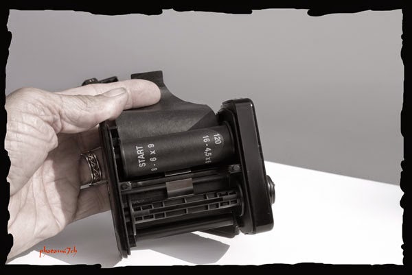
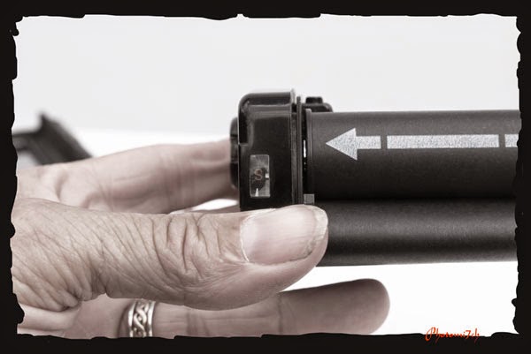
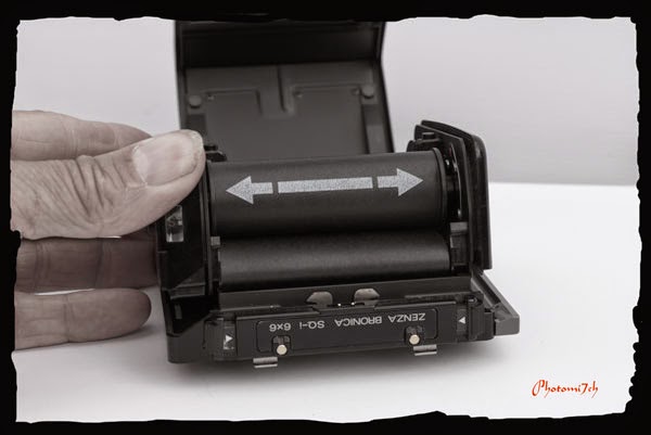
For
years I wanted to obtain a Bronica and when I did it was a very happy
day. The SQAi has done a lot of travelling over the years; in all
sorts of weather and across many different terrains. It has let me
down on a couple of occasions but I do not blame the camera, overall
it has been a great bit of kit. It can be a pain literally on long
treks as it is no light weight, even in its lightest configuration.
I
have not always been happy with the camera. When I first had it I
could not get used to the back to front image which was really
frustrating at times. I was not happy with having to use a hand held
light meter either. I know! why did I

Along
the way, my light meter use has changed; with some experimenting, I
have found that two readings is better than one over all, making
white bland skies with monochrome film a thing of the past. I, like
you, have tried to solve it by using black and white filters from
yellow to red and graduated neutral density filters to name a few.
All of which are now gathering dust some where. Really and truly all
you need to do is take a second light reading. Of what? The brightest
part of the scene which in most cases is the sky and the amount of
time it takes to do this makes it a no brainer. In fact you could
have taken several in the time it takes to read this.

An
understanding of Ansel Adams zone system helps to produce better
negatives.
The
picture right give a rough idea on how it works.
I
have metered skies that have been as much as six stops brighter. In
these cases, would it mean shutting the lens down by three stops to
allow for it? With a little bit of help from the zone system you may
only need to allow one stop to improve the detail in the sky, this
would lead to better detailed negatives. The extra information would
lead to more easily produced photographs.
Yes
you can bracket your exposures which is a good way of learning what
works best for you but as a long term method it is a waste of film.
The idea is to know what works so you can get it right first time.
On
average I have found that the skies in my pictures are about two to
three F numbers brighter, meaning a slight adjustment to the exposure
before pressing the shutter will produce more detail in the sky on
the processed negative, without making the main part of the image
too dark. When it comes to printing, whether burning in or holding
back, depends on which method you prefer to use in the darkroom. My
working method leads me to add light (burn in) more often than take
it away (hold back). The sky is not always the brightest part of the
picture, I'm using it in this case because it is the most common
complaint with developed negatives and to keep my explanation simple.
The following pictures show what happen when the sky is taken into account:
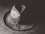
This picture was metered for the piper. I did not take a second reading for the sky. I have been unable to burn the sky in hence the white out so to speak.
With this picture I closed the aperture down by one F number to allow for the sky. For example from F.8 to F.11. As you can see the clouds have been picked out. With a bit of burning in (adding light) The sky would have more contrast therefore stand out.
This is a badly scanned photograph but it does illustrate how well the clouds stand out.
It was a difficult scene to meter. The lighting was changing quickly. The light reading for the sky was indicating a difference of three F numbers in brightness more than the overall reading. In the end I only shut the lens down by one F number. It is a straight print without any burning in.
The following pictures show what happen when the sky is taken into account:
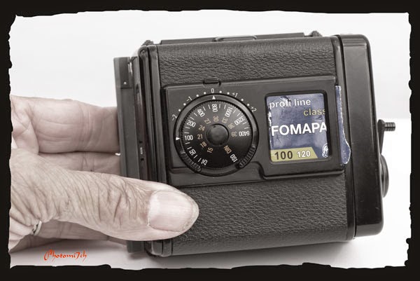
 |
| 120 format Film FP4+, 6x6 negative, Developed in ID11 , Printed on Ilford multigrade RC gloss, Developed in Ilford multigrade. |
This picture was metered for the piper. I did not take a second reading for the sky. I have been unable to burn the sky in hence the white out so to speak.
 |
| 120 format film FP4+, 125 ISO, 6x6 negative Developed in Ilford multigrade developer printed on multigrade RC gloss. |
With this picture I closed the aperture down by one F number to allow for the sky. For example from F.8 to F.11. As you can see the clouds have been picked out. With a bit of burning in (adding light) The sky would have more contrast therefore stand out.
 |
| 120 format Fomapan 100 ISO, 6x6 negative, Developed in RO9, Printed on Ilford multigrade RC gloss, Developed in Moersch 6 Blue. |
This is a badly scanned photograph but it does illustrate how well the clouds stand out.
It was a difficult scene to meter. The lighting was changing quickly. The light reading for the sky was indicating a difference of three F numbers in brightness more than the overall reading. In the end I only shut the lens down by one F number. It is a straight print without any burning in.