Pages

Sunday, 19 October 2014

The Monochrome print and the colour enlarger.

Many years ago I was in a position to purchase a medium format film camera. This led to a complication in the darkroom in that my then current enlarger was for only 35mm film. An extra expense I had not budgeted for! At that time multigrade headed enlargers were quite expensive second hand and a bit thin on the ground. By chance 'the other half' noticed an ad in the local paper, it was for a medium format colour enlarger that came with some other bits to do with colour printing. I had not considered that a colour enlarger maybe just as good. The person I spoke to did not know what size negatives it took. So going to have a look was a gamble but then I only had to go round the corner. To my surprise it was all in mint condition and the enlarger would deal with negative sizes up to 6 x 7 - I was hooked! Apparently the seller had only used it a few times and decided to go digital. We struck a deal and the rest as they say is history.

Once the enlarger was home I dismantled it and gave it a good clean and checked it was all in good working order, not that I expected to find a problem. The big surprise was how dusty the inside was. It was gently cleaned with a soft damp cloth and wiped dry so as not to leave any residue marks. 


The next thing I needed to know was how to set the filters values for use with black and white multigrade papers. I chatted to a friend who pointed me in the right direction. After a bit of digging in the library I came up with a number of values for different makes of enlarger my one included. I thought the values should all be the same. But have discovered that the values are a suggested starting point. I have a set of multigrade filters that I used with my other enlarger at least now I will not have to check them for dust.

 There is a lot of speculation on the subject of using colour enlargers with multigrade papers. They split into two camps - the purists that say the multigrade filters only give the papers true contrast and people like me who check things out for themselves. I am at an advantage in that I have used both methods. Personally I have not noticed a difference but then I have not done a like for like comparison. Would I do one? The only way I can answer this is to say If I was to become dissatisfied with my results I may check to see if there was a difference.
 
The following are the values for Variable contrast papers for different makes of enlarger. The values are for the yellow and magenta filters the Cyan should be set to zero at all times.

Ilford settings

1
2
3
4
Grade
Y
M
Y
M
Y
M
Y
M
0
150
25
92
16
75
12
110
16
0.5
110
33
74
22
55
16
73
22
1
85
42
56
28
42
21
57
28
1.5
70
55
46
37
35
27
46
36
2
55
70
36
46
27
35
36
46
2.5
42
80
28
53
21
40
28
53
3
30
90
26
60
15
45
20
60
3.5
18
112
12
75
9
56
12
74
4
6
135
4
90
3
67
4
90
4.5
0
195
0
130
0
97
0
130
5
0
200
0
130
0
97
0
130

The numbered columns represent different makes of enlarger
  1. Dunco, Devere, Chomega, Beseler, Jobo, Kaiser, Omega, Paterson, LPL,Kodak.
  2. Durst.
  3. Meopta
  4. Leitz
  5. kodak
  6. Durst

Kodak
Grade
5
6

Y
M
Y
M
0
130
0
130
0
1
75
10
65
15
2
50
20
40
35
3
30
35
20
60
4
10
100
10
100
5
0
200
0
180

It has been many many years since I obtained my enlarger and the resulting prints I have produced with it I have been pleased with, so much so that I have not tested the accuracy of the enlargers filters with Ilfords set. If it ain’t broke why try to fix it!
Since writing this ilford have introduced multigrade five making the above tables relevant to multigrade 4 only.  when purchasing paper you should always check the manufactures tables that come with the paper for the latest filter values.


Print 1
Print 2
Print 4
Print 5


Technical data:


  1. 35mm film, Agfa apx, iso 100, developed in ID11, Printed on Ilford multigrade RC gloss. developed in multigrade.
  2. 120 format FP4+ iso 125  , 6x6 negative, developed in ID11,  Printed on Ilford multigrade RC gloss. developed in multigrade
  3.  120 format FP4+ iso 125, 6x6 neg, developed in ID11, Printed on Ilford multigrade RC gloss. developed in multigrade.
  4. 120 format fomapan 100, iso 100, 6x6 neg, ID11, Printed on Ilford FB gloss natural tone, developed in multigrade.


Thursday, 2 October 2014

Mottled prints

The one thing I like about traditional photography is it can be unpredictable. Even though the method you use is tried and tested, guaranteeing to a certain extent, good results, when the unexpected happens there are a lot of questions. Checking the method and chemicals used is great when a clear mistake can be tracked down, but what happens when there isn't?

 Sometime ago I pulled a set of FP4+ 120 format negatives from the processing tank that at first glance looked normal. I was studying the negatives in their sleeve when I noticed that the grain was not as usual.

Anyway, I did no more about it until I printed a number of them, then it became apparent the grain structure was different, so much so that it gave the photographs a mottled affect. I was not impressed, however once the prints where dry I filed them away. 

I went back over the way I processed the negatives, checking everything, but could not find an obvious reason for the way they had turned out. To add to the mystery it was not present on all of them. At the time I had just started using a new batch of PMK Pyro developer. I asked myself a lot questions about: 'did I mix it properly?' 'in the right order?' etc. etc. but could not come to a clear answer. So I shelved the developer metaphorically and literally.

The reason I'm telling you all this is that recently I have been looking through some of my boxes of prints when I came across these pictures again. The funny thing is I now quite like those mottled pictures, so much so that I'm going to print some of the other negatives and do some reprints on different paper. I find it baffling that when revisiting prints or negatives that did not appeal at the time, either compositionally or technically, they have now come into vogue. It is almost as though you are not mentally ready for what your eye is telling you works. In other words you need to keep an open mind even if it is not what you set out to do.


Since writing this I have been reprinting some of the negatives making me question again whether it was a developer fault. There is only one way to find out. 

It is now 2021 and the fault is down to the backing paper in some cases if it is 120 format film.


Friday, 19 September 2014

Mature paper developer


Mature multigrade developer with FB paper.
Notice that it has a very subtle warmth to it.
I happened to mention to a group of dark artists that I use mature developer when printing my photographs. I was a little taken aback in that they did not understand what I was saying and possibly a number of you reading this will not either. Basically it means that I cut fresh developer with old and exhausted developer from other printing sessions. Not always from the same manufacturer. It is something I have done for years and have not given a second thought to.

The technical bit:

Starting with the papers light sensitive coating, they can be made from three materials Silver bromide, silver chloride and silver iodide. These are combined to make three types of coating chloride,bromide and chlorobromide. A number of other chemicals are also added to help things along. The way in which these chemicals are mixed together affects how the final print looks. Chloride rich papers are slower and warmer in tone. Where bromide predominates it leads to faster acting and colder toned papers. As a common rule the material named first has the most influence on the way the paper reacts. Bromide papers are the most light sensitive producing neutral or cold blue black tones.
Fresh multigrade developer with FB paper.
Although the picture is of a cold subject the tone
of the scene is cold as well.

The most commonly mixed materials found today are chlorobromide papers. They are a compromise between speed and colour. By adjusting the percentages of these chemicals the manufacturer can alter the tone from warm to cold and vary how sensitive to light they are. I have found that the new Kentmere RC papers to be very sensitive to light producing a cold look to the print. It's quick reaction to the developer means that full development of the picture can be achieved in less than thirty seconds when developed with fresh Ilford multigrade. Chlorobromide papers tend to tone better than Bromide. If you are going to use gold toner then a chloride rich paper is the better than bromide rich paper as it hardly responds.

This is was printed on Kentmere RC paper with
 fresh developer. It was fully developed in less than
thirty seconds.


Although the tone and tint of black and white papers are subtle it has a great affect on the viewers response. Neutral and cold tones tend to create a distance emotionally, a sense of looking in from the outside. While warm looking images draw the viewer in engaging them emotionally. There is a tendency to use these different tones for certain subjects, cold and neutral tones with landscapes, abstracts and modern architecture. With warm tones being used with subjects like portraits, still life and nostalgic pictures like churches and old barns. We maybe used to seeing them used in this way but there are no rules but those you make for yourself and even then they should not be set in stone. By learning to manipulate and control the tone of the paper you are printing with, opens up new ways of engaging the viewer in your vision of the world.


Printed on warmtone  FB paper using
a sepia tone developer. Again the warmth is
very subtle. when compared to the picture
above.
When talking about tone and colour of monochrome papers it is important to understand there is a difference between tone and tint. The tone of a paper is influenced by how much chloride or bromide there is in the coating of the paper. More chloride means slower warmer pictures.

Paper bases come in different colours/ tints such as off white, cream and variations on the theme. At one time warm tone papers could be made on a brilliant white base but these days the base paper has a tint to it, this allows the manufacturer to reduce the amount of chloride in the mix increasing the speed of the paper and still call it warmtone even though it is the tint we see. Tints are most noticeable in the high lights and tones in the shadows. Because the colour shifts are so subtle an untrained eye may not notice the difference until it is pointed out to them.


This is the most important bit when it comes to manipulating the tone of a paper. The main thing film and paper have in common is grain it maybe invisible to the eye but the bigger it is the blacker it appears. When the paper is placed in the developer the grain increases in size as it grows so it changes in colour. From a yellow to begin with it turns reddish, then brown and finally black which is the point of full development.

Printed on  Ilford multigrade FB paper.
 It has been developed in an almost exhausted developer
giving it a pinkish look.
This is valuable knowledge when it comes to changing the tone of a print for example: If you over expose your print more than the exposure your test strip suggests and then under develop the print by say a quarter of your usual development time this will help to increase the warmth of your picture. If you combine a warmtone developer and paper it will greatly increase the effect.

Now to the technical bit behind the mature developer. What happens; as the developer starts to exhaust, so it has trouble fully reducing the silver halides in the emulsion. This means the developer cannot turn the silver completely black therefore it leaves it in the warmer less processed state. You can induce this state by adding fresh developer to an old/ exhausted one which will leave your prints with a wonderful but subtle warmth. The old, new combination should only be used up to a dilution of one to one. Beyond this can lead to sudden exhaustion of the developer.


Wednesday, 17 September 2014

My new print washer at last.


When I started looking for a new print washer I did not think it would take the best part of two years for it to arrive. Basically I was looking for a new way to wash multiple prints at once without having to stand there and agitate them. Giving me more time to print. It would have been quite easy to go down the road and buy one off the shelf, but I wanted to put some of the knowledge I had gained into building my own.


I was not expecting it to take so long to arrive at a design I was happy with. It was always going to be a slot style washer which meant it would be a little more complicated to build. I was up for the challenge. The easy part was choosing the materiel it would be made from one of two plastics I had in mind. The next was settling on the size, it had to be the same as my slot processor 18” (460 mm) by 14” (360 mm). When starting a project like this you do not realise how many questions need to be answered before the project get off the page. For example: How many prints did I want to wash at once? How far apart should the slots be? What style of slot divider? For each set of questions I solved so another set would take their place. The most difficult ones to answer were what tooling would be needed.


Making sketches of what the washer should look like helps no end in solving some question quite quickly. By doing this it gives an insight as to what will be the difficult parts to put together. One of the difficulties turned out to be the design of the dividers and how they would be put together. This question remained a sticking point right up to the point of having to make the divides. In the end I settled for ones that could be removed, just as well I did because I'm not happy with the design. Having said that they work really well.


Since it's completion it has been in regular use and now I would not be without it. It has done what I wanted it to do - free me up from having to stand and wash each print by hand.


This post looks into Print washing

Tuesday, 9 September 2014

Loading a Bronica film back

college still life
On one particular trip I made into college I was met by my tutor who placed in my hand a Bronica 6x45 camera and a roll of film in the other. Then told me to go into the studio and make pictures of the still life he had set up. Wow! I had wanted to try out one of these cameras for ages, part of this enthusiasm was when I found out that the lenses were made by Nikon. Sadly later models used seiko lenses. This is not to say the quality is any less. At one time I was very keen on all things Nikon.


I placed the camera on the tripod and released the film door to load the film. Which stopped me in my tracks. “How the hell do you make this work” I was expecting it to load the same way as other 120 format cameras that I had used. A short time later the tutor came in to see how thing were going. As he approached he smiled and said “It does not matter how many students I give this camera to you are all stumped by the film loading”. He took the film back and reversed the backing paper over the pressure plate round and onto the other reel. It was that simple.

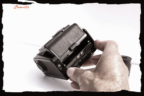
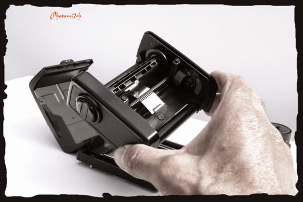
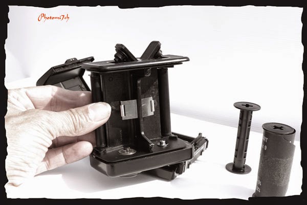
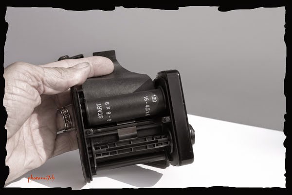
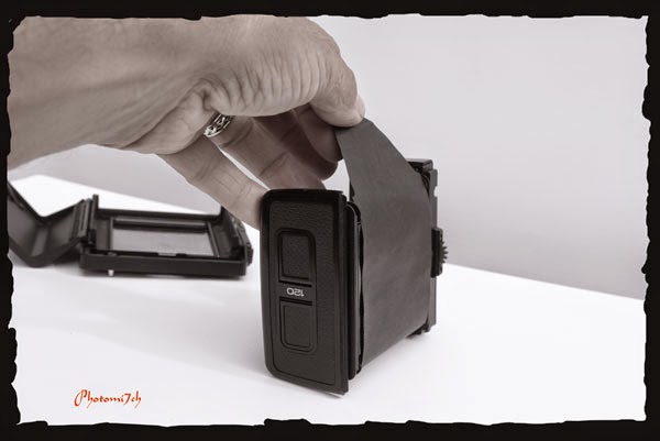
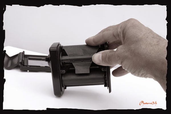
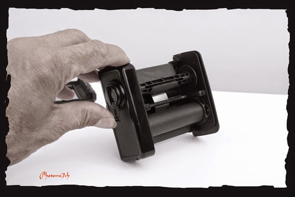
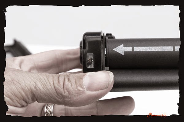
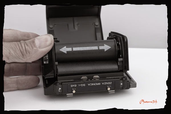
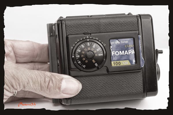
For those who are not familiar with the way you load film into the Bronica here are a few pictures to point the way.

Film backs can be loaded on or off the camera body.

To open the film back compress the two clips on the top. The door will spring open

Remove the film holder from the case.

Push open the film spool holders.

Place the empty spool in the lower holder this is the one with the winder on the side. With the fresh film in the top as shown pull the paper backing over the top.

Pull the paper backing all the way up and over the top

Thread the paper backing into the empty spool as shown

Using the winder on the side of the film holder wind the paper on

Keep winding the paper backing until the arrow shows and stop 

Place the film holder back in its casing and close.

Do not forget to set the ISO. If you use a number of different film tear off the top of the film box and slide it in to the window.

Wednesday, 23 July 2014

Trimming prints a method


I don't know about you but over the years I have found no matter how careful I am setting the printing paper in the easel before exposure, it can still come out wrong. I'm talking about making sure the the picture is parallel to the sides of the paper. It is something we all have to deal with at some point. The problem being you can not tell this until the paper has been processed by which time it is to late.


This means that the paper has to be trimmed true again. To allow for this I have increased the margins around the printed area and even the size of the paper. Which I think is a waste as I would prefer to use the whole sheet to print on. But aesthetically speaking I think the margin around the picture adds to the overall effect and stops finger marks getting on the image. Which leads on to another skill that needs to be mastered, the art of trimming your print parallel. At one time it did not matter what I did I could not get it right, that is until a friend introduced me to the cut edge principle. This is where you use the freshly trimmed edge as your straight edge for the next cut and so on round the print. Wow! what a difference it has made over the years.


The knowledge of this method has helped with the trimming of my FB prints that I stick to a pane of glass so they dry flat - described here in another article. 


Saturday, 19 July 2014

RO9 Rodinal film Develper


Having used up all the ID11 on the four film project and a backlog of exposed film building up, I thought it was about time I break out 'my something for the weekend' developer. I have always kept a backup developer for those occasions when I get caught out. This time I reached for a small bottle of RO9/ Rodinal. This little bottle has been on the shelf for years and in that time it has slowly turned to a rich red brown colour. This single shot developers keeping qualities are legendary. Silverprint has a forty year old bottle that they use from time to time! It still produces good quality negatives, so my 'youngster' should have no problems.

RO9/ Rodinal is not classed as a fine grain developer. It is famous for it's contrast control and flexibility. It's high acutance produces very sharp looking negatives a bit like sharpening a digital file in Photoshop.
It's character to a certain extent is governed by it's dilution.
For example:
  • 1+10 will develop ortho film.
  • 1+25 produces high contrast negatives and the most obvious grain.
  • 1+50 Is the standard dilution producing crisp, normal contrast negatives, with slightly more grain than a fine grain developer.
  • 1+75 and 1+100 will render high contrast negatives as normal.
  • 1+300 can be used with document type films.


This is another developer I have not really used before so when I picked a Fomapan 100 ISO 100 to try it out on there is a little first use nerves! - How will the negatives look? How much is a little more grain than a fine grain developer? Is the time suggested going to produce well toned negatives? All questions that cannot be properly answered until the film has been fixed. My mantra is “keep it simple” and chose the standard dilution 1+50 as this comes close to the development time I use for ID11, which means I can compare these neg's against the ID11 negatives.

I used my long standing agitation method, although on the bottle it gives a different one. Agitate for the first thirty seconds and then tilt the tank at thirty second intervals.


I have used this developer with FP4+,Fomapan 100 and the Rollei 400s and again I'm having trouble with the latter. The other two have presented nicely toned negatives that have been easy to print. They are slightly more grainy than the ID11 negatives I am use to. But you would not think so when you look at the prints, I'm hard pressed to see a difference when comparing them side by side.

The pictures that appear with this article have been scanned from 9 x 12 prints produced on Kentmere variable contrast paper RC. I have found that grade two works better with these negatives than my usual grade three. This maybe down to its contrast controlling attributes. I have also used a couple of negative with the split grade method and again no appreciable difference. I do all my test prints on RC papers and then do my final prints on FB papers. Here again there has been no sign’s of increased grain.

All the pictures were developed in a mature Ilford multigrade developer - by mature I mean at least a month old, that has been replenished once or twice. I find that the prints take on a warmer tone than those first produced in the developer when fresh. It also takes longer for the first signs of the print to appear when fresh, about ten or so seconds and as it matures twenty seconds or so. This is not a method for the faint hearted as it can deplete very quickly in a matter of one print to the next. I have been caught out and ended up with a print that does not fully develop.


Overall I am very pleased with the negatives RO 9 presents. Yes they are more grainy but that does not translate to the final print. While I was looking into the use of RO9 Rodinal I came across a gentleman that has indicated that the original Rodinal could be used as a print developer and it was the exception to the rule in this respect. Does anyone know differently? 

Friday, 4 July 2014

Four Film Positive results

Printing

Figure 1
Before any of my negatives see the enlargers negative carrier they all get contact printed, for me this is the first indication of how they may print when enlarged and for some the only time they become a positive. It also serves as a reference.

The contact prints for the Adox and Rollei show under development, to what extent will only become clear when the test strips are produced. The Fomapan 100 and the FP4+ show as well toned. In the case of Ilfords FP4+ it may be over developed.

Once more I step into the the red world of the darkroom and the smell of chemicals. Only there are none! The developer, stop and fix need to be mixed a fresh. This is due to a problem with the fix turning the slot of the Nova processor black. Still not completely sure why!
   
Figure 2

 I set the light boxes height on the enlarger so it will  generate a print 9”x 12” in size. This means the the 6x6  negatives are going to be brutally cropped; maybe that  should be less dramatic and say 'creatively cropped' to  fit  a landscape format but also serves to increase the  magnification.

 I have set the enlarging lens to F8. All the negatives  will be exposed at this setting, it allows a comparison  to be made as to how over or under developed they  maybe with each other. In the past when F8 is set I  find that it gives me a time in the region of 30+  seconds exposure time. Which for me is about average.

Figure 3
I have set grade two and a half to start with, if this proves to be to hard I'll drop it to two. The paper being used is silverproof matt limited grade paper. Being limited does not mean it has not got a full range of tones. It also provides a certain look to the prints that I like.

The first negatives to be exposed are the Fomapan 100. Looking down the focus finder the film  has a regular fine grain making it quite easy to get it pin sharp. The test strips for these negatives are indicating an exposure of twenty one seconds. The picture of the  woods (Fg1) was to hard for the 2.5 grade I set, so reduced it to 2 for the second exposure. Figure 2  the shadow of the tree reflected in the  puddle. Printed straight, was a little flat, so I printed it a second time at grade 2 but burnt in (added exposure)  to the areas around the puddle to lift the puddle area.

Figure 4
Figure 5
The next negatives to be exposed were from the Adox film. Looking down the focus finder to sharpen these negatives brought a smile  as it looked like someone had gone mad and splattered the grain on by flicking a brush. This may have been the result of under development. The test strips were also saying that the negatives were thin, suggesting an exposure of ten seconds, half that of the Fomapan. The two negatives from the Adox film are the complete opposites to each other. The fence post picture (Fg 3) had no detail I could see in the shadow when held up to the light. So when it was being exposed  I dodged the shadow area for a couple of second to stop it blacking right out.  Once it had dried I was surprised to see lots of detail. The two tree picture (Fg 4) was always going to be a landscape crop as there was to much foreground in the negative. It also looked the best picture negative wise.
Figure 6

The Rollei 400s was up next I had trouble picking two negatives that I could see enough of to print. These negatives were thinner than the Adox with some of the frames not showing at all. When looking  through the focus finder at the grain it revealed it to be patchy and shows up on the prints as white blotches. Lack of  proper development is evident maybe?. The picture of the rain on the window (Fg5) was a difficult print to get right.  Keeping the detail, what there is of it, of the door handle and leaf on the left. It was down to six seconds of exposure. The cat (Fg6) picture was the same six seconds but shows up the blotchy grain more. If I had shut the enlarging lens down to F11 or F16 I would have had more time to manipulate how the pictures looked by dodging and burning.

The last negatives to be worked on were the FP4+. Looking down the focus
Figure 7
finder it displayed a fine regular pattern I have come to expect from this film when developed in ID11. I had been looking forward to printing them but was thrown when the test strip revealed that a thirty second exposure was no where near enough. A further two tests revealed a time in the region of fifty seconds. You could say they were the best developed or over developed depending how you look at things. I printed an number of negatives from this film. I was really taken by the smooth tones of the pictures and the intensity of the sky. It was a bright, warm cloud less day. The prints show what a great morning it was at the bridge.  Figure seven showing the superstructure of the bridge gives a good indication as how good the sky was and Figure eight gives a good idea of how strong the sun was. Both pictures were printed at grade two but could quite easily have taken a softer grade.


Figure 8


Conclusion:

I am disappointed that the Rollei 400 was not developed correctly, I know it can produce some very smooth well toned negatives which would have lead to some great prints. As for Adox film, I am coming to the conclusion that we do not mix as this is the second time it has failed to present a good set of neg's. The Fomapan 100 classic was a surprise, if you are looking for a substitute for FP4+ then you will not go far wrong with this emulsion in my opinion. I have noticed that it is slightly more grainy than the FP4+ if you have to burn in the high lights heavily. I use both these films regularly now in rotation as their characteristics are almost identical.

Links to others from series in case you missed them.