Film
development.
It
has taken quite a time to reach this point. There
have been numerous interruptions, not all of them good, but the
results are in and there are some surprises.
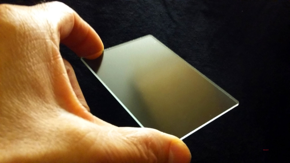
 |
| The different makes side by side |
All
the films are 120 format and 6x6 negative size. They were exposed at
box speed and developed in the same way with the same thirty month
old batch of stock ID11. When I checked the date I was Shocked. It
did explain the slightly wheat looking tone to the developer. To be
honest I did not give a second thought as to whether it would work or
not. The developer was diluted 1+1 and used only once at a temp 20c,
No pre-soak was used. All inverted for the first thirty seconds this
is equal to twelve inversions and then four inversions every minute
this is equal to ten seconds. Then stopped, fixed and washed as
normal.
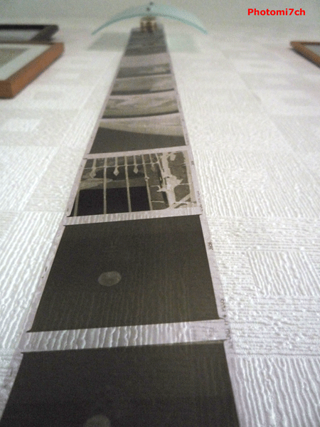
 |
| FP4+ negs |
I
chose to develop the FP4+ first. This is the film all the others are
going to be judged against, so there was no pressure to get the
development spot on. The suggested time by the manufacturers is
eleven minutes, but I find my negatives tend to be a bit thin so
process for fourteen minutes. While the negatives were drying I
looked over them to see how well they had turned out. I was surprised
to find they are some of the best negatives I have produced. Let's
hope I can keep this standard up for the rest.
 |
| Rollie 400s negs |
The
next film to be loaded into the developing tank was the Rollei 400s.
This did not have a very auspicious start after loading the film into
the back of the camera. I had mistaken the noise it was making for
the film coming off the spool. I am so used to the sound FP4+makes
when being wound on. I checked to see if it was OK in a blacked out
darkroom and it was. This lead to four frames being lost. The
suggested development time for this film in ID11 is eleven minutes. I
must say I had my doubts but developed it for the said time anyway.
Need I say they look thin; will have see how well they print!
 |
| Fomapan 100 negs |
The
five litre can of ID11 is getting very close to being used up and the
developer is getting darker in colour each time I use it, could be a
close run thing as to whether there is enough to do two more films.
Next into the soup was the Fomapan classic exposed at 100 ISO. The
suggested development time for this speed is eight to ten minutes.
This is another film I have no previous knowledge of, so which is it
8,9 or 10 minutes?. With the thin looking Rollei negs at the front of
my mind I've chosen ten minutes I feel it may produce better results
and it did. My calculated gamble paid off this time. Producing the
density of negative I like and very close to the FP4+ results.
 |
| Adox chs negs |
The
last one to meet the spiral was the Adox CHS exposed at 100 ISO. The
suggested time for ID11 at this speed is 7.5 minutes. I took no
notice of this time at all. Boyd by the results of the Fomapan I
pushed the time to ten minutes. Where did this time come from? The
previous results indicated that a longer development time would
produce denser negatives so I decided to do the same for this. Was I
right? NO! I should have gone longer. These are the thinnest
negatives of the lot. Again, will have to see how they print.
Experience
and knowledge has played it's part in the development of the Fomapan,
400s and Adox but even so the later two's results are 'off' by my
standard. The times suggested for developing the films are from a
trusted source. So I am a little disappointed that they did not turn
out better than they did. Having said that it maybe the developer
losing its potency as I start to scrape the bottom of the bottle. It
is, to a certain extent, a gamble when using old material, combined
with ones I have not used before. All is not lost, it just means that
the thinner negatives will be a bit more of a challenge to print
properly.
How
are they going to print?
Finally
the Id11 ran out before I had a chance to do another roll of the
400s. If I had, I would have extended the time by three minutes. With
the Adox I would have increased the time by five minutes.