Pages

Showing posts with label traditional. Show all posts

Tuesday 17 February 2015

New header picture.

As you can see we have refreshed the header picture and title with some fancy Text. I have been wanting to change this picture for some time but could not make up my mind as to which picture to choose. Until recently. Funnily enough It's been on display in the lounge for months. Even as a test strip I find it engaging. I have had a number of test prints over the years that I feel have worked better as an incremental image than the final result, so I thought why not! it is in keeping with the ethos of the blog.

The picture is of our 'trolley' sticking his head out of the rear window of the car. He is exceptionally pleased with himself as he has spent the afternoon up to his ears in water and soft gluttonous mud. So much so that instead of being tricolour his fur is slicked down with brown mud so badly he looks like he has used styling gel. Fortunately for us the back seat is covered with several blankets for times like this.

For a dog that loves to play in the water all day I find it strange that as soon as a bath is mentioned he go's and locks himself in his cage and then plays up no end when he is in the bath.


The picture was made using a Bronica SQAi producing a 6x6 negative on FP4+ developed in ID11. It is printed on Kentmere Paper 9.5 x 12 developed in Ilford multigrade. It happens to be one of the first batch of photographs I produced with this new paper. 
 
 
Recently this wonderful individual passed away.
 
He was a kind, cheeky, mischievous and above all of this very happy. He has been a painful lose.
 
 
update 2014 

Saturday 31 January 2015

120 Film paper backing symbols.

When I started to use a zero multi format pinhole camera for the first time, I had a brief moment of panic because I could not remember what the symbols on the backing paper indicated before the frame number. I had also forgotten that the whole family of 120 formats were represented. I had not used the little red window on the back of a camera since my childhood. Fortunately for me it did not take long for it to come back.


Makes of film shown FP4+, Fomapan, Adox.
Beginning of film. (start)


Remember that the frame number also indicates the center of the film you are about to expose so it is important to get this in the middle of the red window. If you repeatedly over run this by the time you get to the end of the film you will only have part of a frame left.


End of film (Finish)

With this in mind the following pictures show you what to expect with different makes of 120 film - not just for winding on but for winding off before you remove the film from the camera. Not sure why you would need to know this when your coming to the end of the film? logic dictates that you just keep winding until you feel the backing freeing it's self from the spool.


The top line of symbols are for cameras that use 6 x 4.5 negatives. The middle is for 6x6 negatives. The bottom for 6 x 7  and 6 x 9 negatives.

Friday 16 January 2015

Thinking in Black and white?


I don't know about you, but I find it difficult to get back into the swing of things after a break. I find it hard to get my brain out of park. It would seem that the longer I get in the tooth the more likely I am to make the silliest of mistakes. Take earlier in the year for instance.


One Sunday afternoon we thought we would take a trip out to the Humber bridge. The day had turned very warm with a light breeze and rolling clouds. Ideal for making pictures. Earlier that day I had cleaned my SQAi and loaded up all my film backs with fresh film. Not unusual in it's self, except one of the backs was loaded with an out of date colour film. I placed this back on the camera and thought no more about it.


It was a great day to walk across the bridge and along the way I made pictures of whatever took my eyes fancy, happy in the knowledge that they would make good mono-prints. After making twelve pictures I changed the film backs with one loaded with FP4+ and continued on my merry way.


When unloading the film backs at home I discovered that the unmarked back had colour film in it and not the Foma 100 I thought I was using. Ah! How would these pictures work in colour? The reason I ask this is because I think and see differently when using black and white film. Or do I?


An unexpected chance to test what I have been saying and doing. When the pictures came back from the lab, the first thing I noticed was the way they had been composed. In fact the colour does not add anything to some of the pictures. I would not have made any of these pictures in this way had I known it was colour film. It would have been a different set of pictures altogether. 


Sunday 19 October 2014

The Monochrome print and the colour enlarger.

Many years ago I was in a position to purchase a medium format film camera. This led to a complication in the darkroom in that my then current enlarger was for only 35mm film. An extra expense I had not budgeted for! At that time multigrade headed enlargers were quite expensive second hand and a bit thin on the ground. By chance 'the other half' noticed an ad in the local paper, it was for a medium format colour enlarger that came with some other bits to do with colour printing. I had not considered that a colour enlarger maybe just as good. The person I spoke to did not know what size negatives it took. So going to have a look was a gamble but then I only had to go round the corner. To my surprise it was all in mint condition and the enlarger would deal with negative sizes up to 6 x 7 - I was hooked! Apparently the seller had only used it a few times and decided to go digital. We struck a deal and the rest as they say is history.

Once the enlarger was home I dismantled it and gave it a good clean and checked it was all in good working order, not that I expected to find a problem. The big surprise was how dusty the inside was. It was gently cleaned with a soft damp cloth and wiped dry so as not to leave any residue marks. 


The next thing I needed to know was how to set the filters values for use with black and white multigrade papers. I chatted to a friend who pointed me in the right direction. After a bit of digging in the library I came up with a number of values for different makes of enlarger my one included. I thought the values should all be the same. But have discovered that the values are a suggested starting point. I have a set of multigrade filters that I used with my other enlarger at least now I will not have to check them for dust.

 There is a lot of speculation on the subject of using colour enlargers with multigrade papers. They split into two camps - the purists that say the multigrade filters only give the papers true contrast and people like me who check things out for themselves. I am at an advantage in that I have used both methods. Personally I have not noticed a difference but then I have not done a like for like comparison. Would I do one? The only way I can answer this is to say If I was to become dissatisfied with my results I may check to see if there was a difference.
 
The following are the values for Variable contrast papers for different makes of enlarger. The values are for the yellow and magenta filters the Cyan should be set to zero at all times.

Ilford settings

1
2
3
4
Grade
Y
M
Y
M
Y
M
Y
M
0
150
25
92
16
75
12
110
16
0.5
110
33
74
22
55
16
73
22
1
85
42
56
28
42
21
57
28
1.5
70
55
46
37
35
27
46
36
2
55
70
36
46
27
35
36
46
2.5
42
80
28
53
21
40
28
53
3
30
90
26
60
15
45
20
60
3.5
18
112
12
75
9
56
12
74
4
6
135
4
90
3
67
4
90
4.5
0
195
0
130
0
97
0
130
5
0
200
0
130
0
97
0
130

The numbered columns represent different makes of enlarger
  1. Dunco, Devere, Chomega, Beseler, Jobo, Kaiser, Omega, Paterson, LPL,Kodak.
  2. Durst.
  3. Meopta
  4. Leitz
  5. kodak
  6. Durst

Kodak
Grade
5
6

Y
M
Y
M
0
130
0
130
0
1
75
10
65
15
2
50
20
40
35
3
30
35
20
60
4
10
100
10
100
5
0
200
0
180

It has been many many years since I obtained my enlarger and the resulting prints I have produced with it I have been pleased with, so much so that I have not tested the accuracy of the enlargers filters with Ilfords set. If it ain’t broke why try to fix it!
Since writing this ilford have introduced multigrade five making the above tables relevant to multigrade 4 only.  when purchasing paper you should always check the manufactures tables that come with the paper for the latest filter values.


Print 1
Print 2
Print 4
Print 5


Technical data:


  1. 35mm film, Agfa apx, iso 100, developed in ID11, Printed on Ilford multigrade RC gloss. developed in multigrade.
  2. 120 format FP4+ iso 125  , 6x6 negative, developed in ID11,  Printed on Ilford multigrade RC gloss. developed in multigrade
  3.  120 format FP4+ iso 125, 6x6 neg, developed in ID11, Printed on Ilford multigrade RC gloss. developed in multigrade.
  4. 120 format fomapan 100, iso 100, 6x6 neg, ID11, Printed on Ilford FB gloss natural tone, developed in multigrade.


Saturday 15 February 2014

The most popular posts of 2013.

William Henry fox Talbot 

These are the ten most popular posts on this site for 2013. In some cases not the best written but then who sets out to write a bad article. I compare it to making pictures, I go out with the intention of producing my best work. I chose those pictures that meet that criterion and share them with you. Then the choice is yours and that means you may not agree.

Of the hundred and fifty or so posts on the blog the following are the most visited making them the most popular.


  1. Fox Talbot a short history.
  2. Darkroom layout.
  3. Preparing the pinhole camera for use.
  4. Basic split grade printing.
  5. Choosing an enlarger.
  6. Print washing.
  7. Test results for Agfa APX 100.
  8. Fuji GW 690111 overview/review.
  9. Dryside of the darkroom.
  10. Keeping your negatives safe.


Saturday 11 January 2014

Paper flashing, Pre-flash examples.

I had not envisaged writing a second post on this subject so soon, but I thought I should have included some more examples with the first post.

Examples:

All the pictures that appear here have been printed on Kentmere VC RC at grade 0, developed in Ilford Multigrade and pre-flashed at one second increments with the enlarger light box at nearly full height and the lens shut down to F16.


Straight Grade Zero print


This picture is a straight grade zero print. When I took this picture I knew it would be a difficult scene to print.


Pre-flashed for one second

This picture has had a one second pre-flash the difference is quite subtle but you can just make out an increase in tone.


Two second flash

This picture has had a two second pre-flash and looks a bit washed out. The tonal range has increased in comparison to the last picture now making it necessary to add the grade five exposure to bring out the contrast and blacks.

Pre-flash test strip:


Exposure curve and Kentmere test strip
in second intervals


I have combined the pre-flash test strip for the Kentmere paper with the exposure curve to show how the test relates to the curve. Intervals 1 to 4 relate to the numbers on the curve.

Example two:

Grade zero print

This is also a grade zero print, when I took these shots I did not think the negatives would require pre-flashing.


Flashed for one second

This picture has had a one second pre-flash. If you compare the two carefully you can make out the subtle change in the sky which appears darker and the  additional tonal range in the details in the shadows.

Friday 13 December 2013

Is it a love affair?

This is the saucy minx of an F5  I use to take most of my photographs with, coupled with the sexy little prime of a 28 mm lens. Add a roll of Agfa APX to caress the back of the focal plane shutter and I'm in for a sensual day of picture making.

With camera in hand I stroll out into a bright day with a gentle heat, fanned by a breeze that shifts the leaves on the trees. Now looking at the image in the view finder that is alive with dancing shadows I wait with finger poised touching the trigger in growing anticipation, waiting, waiting for the right breath of wind to push the shadows into place to complete the composition the eye so lusts for.

Click! anticipation spent, I turn away moving to the next flirtatious view to seduce my eye and so the day is flirted away click by click. Before I know where I am an entrancing morning has been teased away.

 
Not quite what I had in mind when I started writing this cheeky post but it does sex up the thought process behind the taking of each image made. A bit of fun at my expense. Believe it or not there was such a day and the pictures that illustrate this post are the results. A full days exposure and legal too!


Friday 29 November 2013

Ye old R3

Out of date R3
Over recent times I have had the tidying up bug  including a good rummage round in my film cupboard where I discovered four rolls of film. Nothing remarkable in that, I hear you say! However what I came across were two rolls of Rollie retro 100 and two rolls of R3, tucked away in a corner! I know! very out of date unless your name is Mitch in which case they are reaching maturity. It is strange how things come together. I recently posted a very grainy picture of a surfer dramatically falling off his board to illustrate how grainy things can get if you do not process your negs correctly. The film used to take the picture is the late lamented Rollie R3. If I had used the film with a fine grain developer the 1600 ISO negatives would have been a lot smoother.

R3 used at 400 ISO
When available it was advertised as a variable ISO film ranging from 50 to 3200 The idea of a ultra fast film is what encouraged me to purchase some. It took a little while for me to find a suitable subject to test it out on. By chance I was walking along the coastal footpath into Croyde Bay with an empty camera.  So I loaded the R3 set 1600 ISO and spent an hour or so taking pictures of surfers as the sun went down.

R3 used at 400 ISO
I cannot believe that it was 2009 that I last used the R3 and then at 400 ISO, having learnt my lesson previously, I used a fine grain developer. You could not of hoped for a finer set of negatives, they were that smooth it looked as though they had been sprayed on to the film back.


I don't use fast films a lot as I like bright sunny days with lots of contrast. It just so happens I was recently given the imaging warehouses catalogue and while thumbing through it I noticed they stocked Rollie 400s, which got me thinking  how would it compare to the old R3? There is only one way to find out!


Sunday 17 November 2013

Split grade printing the next step dodging and burning .

Top grade Zero
Bottom grade five
The use of split grade printing has changed the way I work in the darkroom. Yes it takes a little bit longer having to produce two test prints, but in the long run it cuts down the amount of dodging and burning needed to achieve a finely toned photograph. I have also noticed a luminosity that has been missing from my graded prints. It has also shown me that it is an advantage and not a waste of paper to make full or half page test strips. You get a better understanding of how much more light is needed for the high lights, so you can build this into the first full print of the scene. This saves time and paper having to reprint it again and again to get it right.

I find that my more contrasty negatives are more easily printed using the split grade method, giving more control of not just the tones but also the contrast. Burning or dodging my prints has been reduced considerably, allowing me to add more detail at the extremes. 

So at what point should you be burning in or dodging? The grade zero exposure being the most important one is also the stage at which you should be making your adjustments. If possible you should be including them for the grade five test strip. By doing this you will have a better understanding of how the contrast affects the corrections and make allowances for them in the final print.

Some of you reading this will be thinking it's all to complicated and not for you, Dodging and burning is about having confidence in your ability, once you have done it and seen how it changes your pictures for the better, you will be wanting to do it every time. I enjoy this part of the picture making process, it always reminds me of a composer on the rostrum encouraging certain section of the orchestra to bring out his interpretation. Only you are using light to enhance what you had in your minds eye.

Burning in graduation times
OK I'm going to keep this simple just to give you the idea of what to do. I have only used grades 0 and 5 but in certain cases other grades maybe more appropriate but that is for another time.

Producing the prints:

I produced a soft toned (grade 0) test print at five second intervals. When it was dry I compared the segments to determine which would give the best overall toned exposure and how much extra light would be needed for the sky. I chose seven seconds for the whole picture, this allowed the street scene shadow to keep its detail without it blocking out. A further twenty one seconds would be added to the sky. With the main exposure done the sky was burned in. For this I used two black pieces of card held together to form a V shape. The trick with dodging (holding back the light) or burning (adding light) is to keep the mask moving otherwise a hard line will be left. I gently moved the card backwards and forwards lingering in places to give the sky a graduated look. The times on the picture are there as a guide.

Now I placed some black card over the masking frame to protect the picture from any stray light, while I adjust the enlarger to grade 5 for the contrast exposure. The first segment was covered and then exposed at two second intervals there after. Again when dry I chose 3 seconds.

Final print
With the all the times combined a full print was made. There are some short comings; firstly the build on the left could do with a bit more burning in to bring out the texture of the wall and if I wanted to be really picky the sky could do with masking in more precisely which would mean cutting a mask that mirrored the buildings outline.
 
The idea was to keep it simple and to show what could be achieved with the most rudimentary of masking off.

Friday 20 September 2013

Avoiding graininess


If you like your pictures smooth and grainless then you need to pay special attention to its avoidance throughout the process. The best approach is correct exposure, development and method; once mastered graininess will not be a problem. When you start using film speeds above 200 ISO it becomes more critical to get the exposure right in some cases a faster film has been used when a slower one would have done the job just as well. In this instance a fine grain or ultra fine grain developer will go a long way in inhibiting the clumping of the silver hilade crystals during the processing, allowing quite large prints to be made without the grain showing.

The main causes of grain growth are:

  • Over exposure.
  • Too highly concentrated developer solution.
  • Too long a development time.
  • Too high a temperature.
  • Too much agitation during the development process.


    This picture was taken using Rollie's R3 variable ISO film set at 1600 ISO developed using R3 developer. If I had used a fine grain developer the grain would not have been this exaggerated. This picture was taken late almost to late as the sun was just off touching the horizon. If I had set 400 ISO it would have been a blur. Apart from that I think it is a good shot caught just at the right moment.

Friday 13 September 2013

Same picture different camera.

The recent airing of a documentary on Vivian Maier sparked a debate between my wife and myself not on the wonderful pictures taken but about her camera equipment and what it has added to her pictures.

Fg 1
Vivian used a twin lens reflex camera (TLR). As the name implies it has a viewing lens of the same focal length placed above the lens in front of the negative. They are coupled together so when the viewing image is sharp it is the same at the focal plane. There are several things to note when using this type of camera. One of the oddities is the image; it is reversed, left is right and vice versa. So if someone or object is moving towards the left of the screen the camera will need to be moved to the right.  It is something that is a bit disconcerting when using the camera, more so for the first few times. The view screen gives no indication of depth of field until the negative is printed as there is no aperture settings. This lens design also exhibits the parallax effect this    is where the juxtapositions between far and near objects are seen  differently between the two lenses. This can be compensated for by moving the picture taking lens up to where the viewing lens is positioned.

Fg 2
With the idiosyncrasy of the TLR explained, it makes the street pictures she took even more wonderful. But I digress, this post is really about - 'does the camera add something of it's self to the picture?' In other words would you have taken that picture no matter what camera you were using?


I have canvassed opinions from other photographers and it has been suggested that the different working methods needed for different camera types and formats would indicate that the camera adds something of it's self to the picture. Or is it just perception? I will admit that certain cameras like the Lomo fisheye 2 undoubtedly adds to the composition in a particular way with its fish bowl negatives and distorted edges, this is also true of the pinhole camera with it's long exposures and blurred movement. These camera are chosen because of these attributes but the same could be said for the main stream digital, 35mm, medium, large format multi lensed system cameras. Maybe the premise is wrong and it is the lens that leaves its mark so to speak.

Fg2
Lets be honest there are a multitude of factors that come into play when making a picture. With the camera lens combination playing the leading roll. I have not until the above question arose, made the same picture with different cameras and formats from the identical place. In my case it just does not happen.


Figure 1 Lomo fisheye 2 and figure 2 Nikon F5 with 28mm lens both 35mm Agfa APX 100 film @ ISO 100 are a couple of examples where I have made the same picture with a different camera in about the same place.


In conclusion the camera and lens you choose to use has an effect on the pictures you take therefore imparting something of is self on the end result.


Fg1

Saturday 6 July 2013

Using the Agfa Isolette camera


Carrying on from a previous post on the Agfa Isolette The opportunity to use the camera was provided by a break in the weather - it cleared enough not to be soaked as soon as you leave the house.


The flip out film holder makes it easy to load a new roll of film. There are in built springs that provide friction, so the film is kept tort, keeping it as flat as possible at the focal plane reducing distortion. The film back clicks shut with a reassuring clunk. It also has a little red window in the back with a sliding cover in which to view the film numbers as you wind on. The film is advanced with a knob on the top right hand side of the camera that has a built in reminder to wind on after each exposure otherwise the shutter will not set.

To reveal the lens you press a button on the top left hand side. In this case the lens followed by the bellows leaps forward from the front of the camera with an enthusiasm that can knock it out of your hands if you are not prepared for such athleticism. Once the front is open you are presented with the five main controls: lens focus, a full set of apertures from F4.5 all the way up to F32. A limited number of shutter speeds: B, 25th, 50th, 100th and 200th A self timer and most importantly a lever that primes the shutter for release. The only other thing present is a connection for flash.

On the top of the camera is the shutter release that allows a remote cable to be fitted, a cold shoe for a range finder or other accessories and another knob that has four settings marked Col NK, NT, K and T. (I do not have a clue as to what they represent.) As far as I can tell it has had no affect on my negatives. It has a viewer and a tripod mount.


After I got used to the idea of guessing what the distance should be set to and then remembering to alter it for different views, I found myself taking shots quickly almost like an automatic. I did take light readings to start with but it became clear that the light levels were stable enough not to need checking for each shot.

It became clear that there was a problem once the negatives had been developed. Some how light was getting into the camera. Having checked it carefully before hand I should have carried on and cut a piece of light sensitive paper to fit the camera and left it for a minute to make sure. Once the paper had been developed in the normal way it would have shown that light was leaking in from the bottom right corner of the exposure chamber indicating a problem with the bellows.


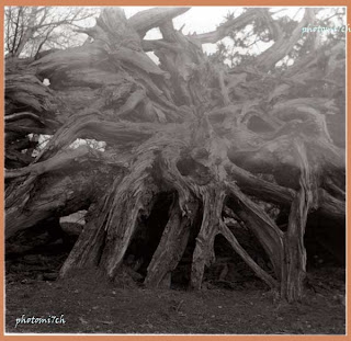
I'm a little disappointed with myself for not doing this check in the first place. If I had followed through with the test, I wouldn't have had a duff set of negs'!. It would have made an interesting set of prints as the gremlin's face in the tree roots shows.