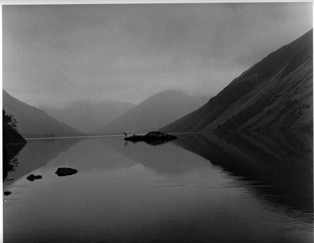
Pages

Wednesday, 31 January 2018

Welcome to the new Year.

What a great start to the New Year for some with all that snow turning the landscape into a photographs paradise! Unfortunately, this part of the country is in the middle of a monsoon, in fact we have had that much rain I'm surprised we have not floated off into the North sea! Dull, dark and uninspiring, I am pleased to have a darkroom when the weather is like this.


A bit late I know, Welcome New Year! I had told some of my regulars that I would be posting a number of articles over the Christmas period. It did not happen and you have my apologies. December was so busy and passed by so quickly I feel I have lost a month from last year.


In case you did not know, this blog has always been a collaboration - so I need to say a big thank you to the editor for keeping it legible and concise. With that in mind we are looking for contributors and it does not matter if you blog or not. Maybe you have had an inkling to blog but do not want the hassle of doing the whole thing yourself or you would like to try it out before you get stuck in. Needless to say it should be photograph related. If you would like to contribute your thoughts and pictures please do. We have no set length, a few hundred words will do but definitely no more than a 1000. You will get full credit and links to your web site, blog if you have them.

 As you will have noticed I have refreshed the header for the new year. Something that has become a bit of a tradition. We may refresh the whole site in line with our mobile offering. Along with other subtle changes when we get the time.

I am not one for New Years resolutions it is just something I don't do. But I am going to try and use my Multi format pinhole camera even more than last year now that I have found a film, developer combination that gives the images a certain style that I like. I'm just not sure which of the 120 format family to use or what paper to print them on. I have some ideas as to what I will make pictures of and already know some of them will be double exposures whether I like it or not.


All I need to do now is thank you all for reading the articles from the year just passed and wish you all the best for the Year ahead. Keep well and creative.

Accompanying images:

Were all made using 35 mm Kodak  gold colour negative. A number of different cameras were used I know one of them was a Nikon FM. Locations of the images are not remembered apart from the first one which is Yosemite valley looking towards the falls.

Sunday, 28 January 2018

The photograph

The photograph is the positive result of a long journey from making the negative to the print. Once you get to the point of printing it starts another odyssey of creativity, along with another set of decisions as to what materials you are going use to produce those wonderful photographs.

Recently a photographer said he only uses the materials of his chosen manufacture to produces his images. His position is they know best so why make things difficult by using different products. At one time I was the same using paired paper and developer to produce prints. But with the death my father I'm questioning this approach; it has made me seriously think about the materials I choose to use. Why? Because life's too short for such restrictions and I've started to believe that the choice of materials you choose to use has a direct impact on the look of the final image and therefore it's style.

In today’s world of analogue photography there is not the vast array of papers there used to be. Light sensitive papers fall into three tonal types: neutral, cold and warm and come as resin coated and fibre base with a number of different finishes. Now-a-days the main stream papers are variable grade meaning you no longer need to stock a number of set grades of each type of paper you prefer to use. This has given greater freedom to stock a number of manufacturers paper types. For example I have stocks of Ilford, Foma, and Adox on the shelf in warm, cold and neutral tones. This has given greater creative latitude when it comes to exposing negatives, this has lead to less stringent light meter readings and less time trying to make the conditions fit the grades of your printing stock. I have in the past used a particular developer for my prints so it conveys a feeling on the subconscious level, for example, adding warmth when in fact the scene is cold. Is this not part of the creative process? For some it would seem not.

Analogue photography is all about the photograph. If you do not hand print your pictures you are missing out.

Accompanying pictures: 

All images scanned from photographs. The papers used in order of appearance, Kentmere VC select RC gloss, Ilford Multigrade 4 RC gloss, Fotospeed RC gloss, Foma 542 chamois FB gloss. 

Since writing this the wonderful Foma chamois has been discontinued.


Saturday, 20 January 2018

Photography a bit of a strange fish.

Nowadays photography is referred to as a visual art bringing it into line with the more traditional painting, drawing and sculpture, to name some of the most obvious visual art forms.


What confounds me with photography is the obsession with the equipment and processes to the detriment of the image. After all, the camera is only the paint brush that allows the artist to convey their vision of the world, and yet photographs get bogged down in all the beguiling wizardry of what is essentially a little black box with or without a lens attached at one end and some light sensitive material with a switch that lets the light flood in when pressed.


The most important part of this symbiosis is the eye and mind behind the box. Without it, these boxes are fancy bits of sculpture sitting on a shelf and yet we talk non-stop about this feature or other. That at the end of the day the image you make will not throw it's hands up in the air and stamp it's feet because you are not using the latest most expensive technology!

 If you have one of these wonderful bits of wizardry, should you not do it justice and make wonderful compelling images? The real crime is that most of these pictures languish on a computer or photo sharing site are not necessarily the best you can produce? - those you feel are really well crafted will they ever see the light of day as a print or photograph hanging on the wall or better still someone else's?
 
The images that appear here are a mix of digital and film.  

Sunday, 14 January 2018

T max 400 a wonderfully smooth finish.

Whilst putting an order in and perusing a suppliers web site I suddenly had this urge to find out what the cost of using Kodak's T Max 400 would be in 120 format. I have no idea where this thought came from or why! Anyway I had a look and by chance it was out of stock. I still do not understand why I should want to use it. In the main I have not used film faster than 200 ISO for decades. I have been happy to go about my picture making at 100 or 125 ISO.

Some months later out of the blue I find myself buying ten rolls of 120 out of date Tmax 400 which just so happened to be part of a job lot. If I'm honest I would not have purchased them at all if it had not been for the Tmax. All I can gather is my creative subconscious has an idea of some sort that will reveal it's self over time!

I am no expert in the way the mind works but I get a sense of when it is the right time to get things done. I sometimes find myself sitting back waiting for that feeling to get on with projects, when it happens I find I am very creative for a short intense period of time. Once that need to be creative is fulfilled the project has to be more or less complete, which happened in this case with the images that accompany this article.

We had a pile of logs in the garden waiting for me to chop up when I had the time. They were starting to nag at me to get on with the job when I noticed the way a particular branch was lit - it brought out the texture of the wood in an interesting way. For some reason it also made me think of a severed arm the more I explored the pile of wood the more macabre it became to the point where another branch looked like a limbless torso. My god! my mind has gone into overdrive and it was not Halloween! It just goes to show how powerful your imagination can be - I could no longer bring myself to cut the wood up! 


Some weeks later I was looking out the window at the logs again - I know! But what struck me was the quality of the light. It was very bright in a soft way as though some one had put a soft box in front of the sun. I went out to look at the sky it was covered with very thin cloud, like a mist. All at once the idea for making images of the logs fell into place.

To make the images as surreal as possible I had to separate them from the landscape, which meant I had to set up a background in this case - I felt that white would do the best job. I worked as quickly as I could because I was not sure how long this wonderful soft light would last. I had no time to test the white background idea just go with the flow. The lumps of wood were very large and heavy for a set of still life images.

T Max 400 grain, film developed in RO9.
 As to what film I should use there were no second thoughts - the out of date T Max 400. I pulled a number of rolls out of the cupboard before I loaded them into my Bronica SQAi. I used my hand held light meter to check how bright it was. The rest as they say is history.

The light lasted the best part of the morning and a number of rolls of Tmax. Which was fortunate I was in a creative wonderland that stopped abruptly after about a couple of hours. The flow of ideas had gone so it was time to pack up and move on. The intensity of the project had left me worn out! The images do not convey the size and weight of the logs I had been moving around. It was time to sit down, regain my energy over a cup of tea and consider how they would be printed.

I was excited and apprehensive all at the same time. Excited to see how the negatives and prints turned out but also apprehensive at the possibility that the light readings could be wrong as there was not time to double check so the film could be empty of images. My other concern was with the development of the film. I had a time of 10 minutes at 1+50 for the RO9 I would be using. Having not used this film developer combination before I could not tell how well they would come out until the wet negatives were hanging up to dry. In these situations I process the film one at a time so I can adjust development if needs be.

I was shocked in a pleasant way when I first looked at the dripping negs. The detail and tone were superb. The superlatives kept coming as the printing got under way. The negatives have a super fine grain with great tone and detail. I printed them on Kentmere RC gloss paper because of the arctic white tint which tends to increase the contrast of the negatives. I would have used FB paper but I did not have any cool tone paper in stock so used the next best thing. I needed the bright white background to enhance the surreal look, not that they weren't that already.


It became clear that if I wanted to keep the stark white background then there would need to be some burning in of the light wooded areas to bring out the detail and maintain the softness to the shadow. It would have been criminal not to exploit all the fine details the negatives held. This extra work did not take away the Eminence pleasure it was to make these prints - even the ones that went wrong - believe me I make some stupid mistakes sometimes that I can't believe!

I really did not know what to expect from the T max 400 especially as I was using RO9 ( it depends on which manufacturer you use as some are finer working than others) not known for it's fine grain and less so with film as fast as 400 ISO. The grain produced is quite fine considering the developer used I suspect it would be even smoother with a developer noted for it. These T grain films really are a jump on from the more traditional emulsions. Is it better than Delta? it is difficult to say without doing a straight comparison between the two. I'm exceptionally pleased with the results.

Oh by the way the pile of logs are still there! Thanks to a friend the pile has grown in size and weight and will take even longer to chop up!


Friday, 12 January 2018

Newton's rings. Updated


This effect can happen when using medium format and larger negative carriers as they use glass to keep the negative flat. Most carriers today use a frosted piece of glass above the negative known as anti Newton glass. 
The rings occur in the areas where two clear smooth flat pieces of glass lie next to each other but do not quite touch. The interference happens because the light rays are refracted, this produces irregular shaped dark rings in the projected image. This will happen more readily if any of the surfaces are wet. You can get round this by using a paper mask with the negative in the carrier. This will block out the light in the places where there is a gap between the glass surfaces. You will need to check the projected image to see if they are still visible.

Tuesday, 9 January 2018

Picture post Tenth floor.

All the photographs you see here were made on the tenth floor of the Tate Modern It is a great place to visit. I have been many times and have always had a good day.


Technical Data:

Bronica SQAi with 80 mm lens, 120 format 6x6 negative Fomapan 100, iso 100, developed in RO9, printed on ilford multigrade develop in multigrade.


Sunday, 7 January 2018

Is it normal?

A while a go I was reading one of Tim Clinch's articles, in it he suggested that If you were thinking about becoming a professional photographer you should read Annie Leibovitz at work as he considered it a must. This prompted me to re-read it. Being well written, it is easy going taking me no time at all to get through it. 

When Annie was young she was obsessed with making pictures so much so it was impossible for her to leave the house without a camera. Annie learned later in life that it was OK not to have a camera in front of her face all the time and that some images should remain untaken.

Annie Leibovitz started as a photo journalist progressing to commercial and magazine work. The latter requiring a different approach which she had trouble adapting to. This was because she liked the spontaneity of photo journalism's, capturing the moment rather than having to make up images to fulfill a brief.

One of the things that struck a cord with me was the way she used her medium format camera, she suggested it was unorthodox to hand hold and move about the way you use 35mm. I have always used my Bronica SQAi hand held in the way she mentioned. I have never considered it to be unusual. Thinking on it, my Bronica has been swung through the air unsupported from the first day I picked it up. It has been held at arms length above my head to make a picture over the heads of a crowd and out over the side of a bridge to look down on its side at arm length so I can frame the picture. It has been up mountains, round lakes, along coasts and beach's, through cities and on long walks across country. All without the sight of a tripod. Admittedly by the end of the day my arms feel like I have been weight lifting - more so since I fitted a motor-drive to get round a problem and added an eye level viewfinder. What I'm getting at is it is OK to read and take note of what others do but do not let it stop you thinking outside the box.

The Bronica maybe my favourite camera to make images with, but sometimes I long for days past when life was less weighty and the camera was a Nikon FM.

Fg1

Fg2
Technical  data:

Fg 1, FP4+ ISO 125, Developer ID11, Printed on Ilford Multigrade RC Gloss.
Fg 2, Out of Date Fujicolour, Edited in Photoshop elements.


Saturday, 11 November 2017

Picture post images made using a Zero multi format camera.

These are the photographs that were mentioned in Many formats in one camera


Print from 6 x 9 negative


Print from 6 x 6 negative
Print from 6 x 7 negative

Print from 6 x 7 negative
Print from 6 x 6 negative

Print from 6 x 6 negative


Print from 6 x 4.5 negative

Print from 6 x 4.5 negative.
Technical data:

Film Fomapan 100, ISO100, developed in RO9 at 1+50, Printed on Adox MCP RC gloss, 6 X 4.5 negatives printed on Silverproof paper  Matt no longer available. All developed in Ilford multi grade. 


Pictures for sale

Friday, 10 November 2017

Many formats in one camera Zero 6 x 9 pinhole.

Zero 120 multi format pinhole camera
I've had my Zero 6 x 9 second edition multi format camera for years  I don't use it as much as I should this is because it comes into conflict with my Bronica SQAi which I really love using. I enjoy using the Zero but have found that it is spending a lot of time in my camera bag. This shouldn't be the case as they both have completely different characters. Since the beginning of the year I determined that I would use my pinhole camera more. I have been true to my word in that I have set time aside, it maybe the simplest way of making images, it also happens to take time to set up and expose the film. Not always conducive for the way I go about making images. The strange thing is I need a certain frame of mind when I want to use it. 

How the different negative
sizes look.
Being multi format I thought it was time to see how the other formats come out. I know after all these years it will be the first time I explore the formats ether side of my favored 6x6 negative size. So what are the other sizes, down stream is 6 x 4.5 I had not realised until I had moved the partitions to this position that with the camera horizontal it produced the frames in portrait format and that if you wanted landscape I had to stand the camera on it's side. I chose to keep it the way it is.


Upstream from 6x6 is 6 x 7 and 6 x 9 this will be the first time I have made images at these negative sizes so I'm excited to see what they will look like. Something else I did not realize was the large margin between the frames for 6 x 7. The margin is that big I think you could get another frame if the numbers were spaced differently on the backing paper. I'm used to the frames on some occasions with 6x6 bleeding into each other. When it came to the 6 x 9 negs there is no margin making it look like one image over the whole length of the film. Requiring precise cutting when putting them into the storage sheets.

How the different negative sizes are achieved.

It is simple to change the negative size with the Zero you just move the little divides into the preset slots once done you load the film and away you go. 

It has taken quite a time to realize that Fomapan 100 in my case developed in RO9 gives me a stile of image that I really like, making it my default film, dev combination when using this camera. Although that my change since I started using delta 100.

There is a picture post to follow showing some of the images made using the different formats. They have been posted click here.

Friday, 3 November 2017

Ilfords Delta films A big surprise.


I read a lot of stuff in search of inspiration and ideas for this blog. And one of the strangest things I read a lot is the lack of willingness to push creativity. For example: 'I will only ever use FP4+ - I only make landscape images.' Why? I have never understood the idea of painting yourself into a corner, creatively speaking. I have been writing this blog for around a decade now, the one thing I have discovered is that choices, likes, dislikes move on naturally and to say never say never really only means for this period of time.

Delta 100 negs
Like wise I have never given Ilfords Delta range a second thought. Why? It just has not been on my radar. I have been happy making images using FP4+ and Fomapan 100 among others. All of a sudden I find myself saying to a friend that I will purchase his out of date delta. And now I have about 15 rolls delta 100 and 3200 120 format in a box on the floor waiting for me to use it.

 I have already exposed one roll of 3200 at box speed, which just happens not to be the rated speed of the film in this case. It is actually rated at 1000 ISO something I was not aware of at the time I used it. Which means that the film was pushed five stops, something of a first for me! I've also used a couple of rolls of 100 at box speed.


Delta 100 grain seen through a focus finder
OK so what is so special about Delta film? It is Ilfords offering in the T grain category of film emulsions, Kodak call theirs T Max and Fuji Neopan. Known as tabular grain film, meaning that the shape of the silver halide is relatively broad and thin, with two well developed parallel faces. This leads to the crystal absorbing more light sensitive dye. It also reduces the scatting of light which increases resolution. This leads to a film that works in all sorts of lighting conditions. If you think about it, it is ideally suited for beginners, making it very tolerant to bad exposure.

Print from delta 3200 ISO 3200
Tabular crystals dissolve more slowly than traditionally grained films when it comes to fixing them. You are advised to increase the fix time as it takes twice as long for the film to clear when using rapid fix.

In truth I am not someone who can go out and make images of anything just to try out a new film. Even when it is well out of date, some of you may think it's a bit risky. I believe it is a waste of time if the images you make are not well composed and of subjects that you enjoy. After all a good image is easy to print and share. A project that would suite the Delta 3200 droped in my lap. I had the opportunity to photograph a number of five week old pups. When it came to photographing them they had all worn themselves out and were fast asleep. That is until I started making pictures! Its funny how noisy a Bronica SQAi with an motor drive can be in hushed conditions!

Print from Delta 3200 ISO 3200

I was a little disappointed with the 3200, although it was very bright outside the room was a bit dark and on a couple of occasions I was down to 60th sec at F2.8 which is the minimum aperture for the lens I was using and as slow as I could go hand held. It was not practical to use a tripod as they had tucked them selves into lots of little cubby holes to sleep.


Print from Delta 100 ISO 100
I developed the film RO9 at 1+50 for the suggested time of eleven minutes. The negatives look a bit underdeveloped (thin) I will, for the next film, up the developing time.

When it came to printing the negatives the underdevelopment showed it's self on the segmented test prints. Indicating that 15 secs was the best exposure time. I chose to use Adox MCP paper set at grade 3. The enlarger was set to a height for 11 x 12 paper but the easel was set for 8 x 10 paper with white margins. I did this because there was a lot of dead space on the negatives. The down side is that the prints are a bit grainy. Something I should have expected to a certain extent seeing as I have used RO9 to develop them with. The final prints were a little soft even though they have been printed at grade three.


Print from delta 3200 ISO 3200
 
Having read the above it may lead you in to thinking it was a bad set of negatives. On the contrary I am very pleased with the results although a little disappointed with the contrast, but then you have to take into account that it is the very first time I have worked with this film. Fortunately I have more film to play with.

I have also exposed a couple of rolls of Delta 100 at box speed developed in RO9 and by comparison they are very punchy (high contrast) they remind me of the Fomapan 100 negatives I produce with the above developer. The 100 has produced super smooth looking photographs. Something I have been looking for for sometime. This may replace the need for a ultra fine developer.

Print from Delta 100 ISO 100.
last laugh goes to the cat a sleep in the sun.