Pages

Showing posts with label photograph. Show all posts

Saturday 14 January 2017

Living with Tetenal Eukobrom AC

Developer
Tetenal new Eukobrom AC is proving to be a delight to work with. I did not realize how much of a irritant the smell of the developer was until it had been removed from the equation. I no longer have developers nose where the smell lingers long after I have left the darkroom. 

In an early article on this developer I had a couple of questions: Personally the main questions yet to be resolved are its keeping qualities and whether or not the image will be warm when the developer starts to deplete. One of these has now been answered, that is it's keeping qualities. I have been using it in my slot processor, at the end of each print session I leave the developer in the slot and cover it with the lid. The amount of time between each print session varies a lot from days to weeks sometimes months.

Slot processor
 Two things have come to light. If you leave the developer in the slot you should give it a stir before you start using it again. The active ingredient can separate out dropping to the bottom. I was caught out thinking that the developer had come to the end of it's working life because it had been left for two weeks. Something I did regularly with Ilfords multigrade without loss of usability.


Something else I have not experienced before was a black and white crystalline substance on top of the stop bath. It was a very heavy build up making it difficult to remove the top off the stop. The stop it's self was clear and still at the level it had been left at, turning out to still be working even so I changed it. This maybe an interaction with the vitamin C - something to keep an eye on.

The other question about the warming of the prints as the developer depletes still remains unanswered. This due to the fact I have not processed enough prints with the fresh developer. Once I notice I'll let you know.


Finally I have used this developer with a number of makes of paper now - RC and FB, natural, warm, cool tone and tinted papers - With great results, so if you have not tried it yet, do so! you can get it in 250 ml shots which is More than enough to get a feel for the way it works and looks.


Technical Data:

Developer Tetenal Eukobrom AC, paper Kentmere RC gloss. 


Saturday 10 December 2016

What can Contact prints tell you.

I have written on this subject before outlining the advantages of making a contact print for your negatives. The subject has come to the fore because a recent example shows that the negatives are poorly exposed and possibly have a higher than normal amount of contrast.


 So where to start? With the sheet of negatives. The first thing you notice about them is that they are well developed with good tone and detail but on the dense side, meaning they could be over exposed / developed. Something that can sometimes be difficult to judge from the neg's only.
 
The contact print is saying that the negatives are well and truly over exposed and or over developed meaning that to get a balanced image is going to require a longer than normal exposure. It is also suggesting that the images are hard (a lot of contrast) How much will not become apparent until the segmented test print has been produced.


My normal exposure set up for the enlarger is F8 at grade 3 this is my datum point to which I judge how well I have exposed and developed the film. The first test print confirms that the negatives are very over exposed, requiring a second test because the results are so weak. I must admit that I was a bit blasé with my pinhole camera exposure times. This camera tends to bring the worst out in me when it comes to proper control but then it is all part of the fun.


I have already compensated for the longer exposure time by opening up the enlarging lens to F5.6 doubling the amount of light I would usually need. I also know that the contrast is higher than normal from a previous set of exposed photographs. It is to do with the Studional I used to develop the negatives in. A previous session showed that the softer grade 2 would give better results.


Without the contact print I would have spent much longer in the darkroom making test prints to find what the base exposure should be, if I had not been pre warned. It also indicated that the completely white looking skies would require a lot of burning in to bring the detail out shown on the negatives.


For me making a contact print ensures that I get the most out of my printing session. It allows me to preplan what I need to do to get the best out of each negative without wasting a lot paper and time. The later for me is always in short supply.


Technical data:

Zero pinhole multi format 120, tripod used, Film Fomapan 100, ISO 100, Developed in Studional, Printed on Ilford multigrade gloss RC 8 x 10, Developed in Tetenal Eukobrom 
AC.


Unintended double exposure.


Saturday 3 December 2016

Freestyle printing session


I don't know about you but sometimes I find the constraint of having to make a segmented test print to determine the right exposure for each negative tiresome. I sometimes feel that it interferes with the creative process. On these occasion in the darkroom I put myself to the test with what I call free printing. I can see some of you shaking your heads at such a notion. It is a way of pushing your instincts creatively. 

Let me lay out the rules of this creative freedom. I pick a random sleeve of negatives, run my eye over them to see what catches my attention. Load that negative into the enlarger and then make a half sheet test strip at five second intervals. This will be the only test strip of the session providing the starting point for each subsequent negative I opt to print. I give myself two attempts at getting the exposure right using my experience and knowledge (best guess) to refine it with dodging and burning. This is where your print technique is put to the test and your ability to choose negatives of the same density.
First print.
 

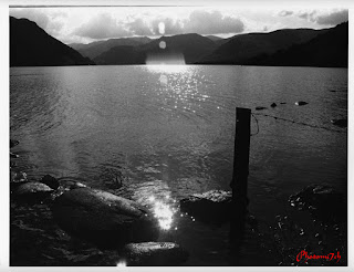
Into the darkroom. I have chosen a set of 35mm negatives that have a selection of landscapes I made while I was in the lake district and the one that took my eye was looking across the lake into the sun. As gooder place as any to start the printing session.


After adjustments

With this negative loaded I set up the enlarger as follows: the lens to F8 and the paper grade to three. These are the most common settings I use when printing. The paper used is silverproof matt. With the test strip made I look carefully at it to work out the overall exposure and how much more light may or may not be needed for a balanced print. 


The mountain into the sun image is the one I made the test strip for. Even so it proved difficult to get right. I chose to print overall at 32 seconds adding an extra 15 secs for the sky. This did not allow for the mountain slops on the left of the picture which needed less light to stop them completely blocking out. The burning in of the sky did not take into account the brighter area to the center right leaving it a bit blown out. So for the second print the mountain slops to the left were held back for -7 secs and the off center sky received a further +15 secs.

Before adjustments

After adjustments


The second negative chosen was the fence post into the sun. I already knew that overall this would require less light to print, the trick here would be by how much, after a bit of consideration I opted for 27 secs. Which worked well but I felt it needed even less. Overall the second print was exposed for 24.5 secs with an added 5 secs for the sky. Not much of a change, but the affect on the foreground was positive.


Before

After

Right first time no adjustments


The third negative is of the dog in the lake. I chose 25 seconds for this because the negative looked a bit dark indicating some over exposure. I was too bold with my exposure time as the print is a bit washed out with no sky. So I up it to 28 secs and added +28 for the sky. In cases where the sky is whited out I double the amount of light when burning in. Overall a much better picture.


The final image looking through the trees is a straight print, the overall time is 27 seconds. I'm happy with the print, yes I could adjust a couple of bits, but they would not add much to the overall look.

Free flow printing sessions are not always successful but it does free my mind especially if I'm having a bad time getting a picture the way I want it. 

Friday 28 October 2016

Picture Post Zero

It has been sometime since my last article reasons behind this absence will become clear in later posts.

To get things going here are some images I made with a Zero pinhole camera multi-format.  


Technical Data:

Zero multi format, Negative size 6x6, Film FP4+, Developed in ID11 (first five), Developed in RO9 (last three) Printed on Ilford multigrade RC gloss, Grade 3, Developed in Multigrade.


Wednesday 16 March 2016

H. BC word of wisdom 2


Photography seems like an easy job but it demands a strength of concentration together with an enthusiasm and a particular discipline of mind. It is through great economy of means that simplicity of expression is attained. One must always take photographs with the greatest respect for the subject and from one's point of view.


This is my personal choice: from this I have a very strong prejudice against photographs that seem ' pre-arranged' or 'set up' 

By Henry Cartier Bresson

Saturday 16 January 2016

Welcome to 2016

Seeing as this is the first post of the year I would like to say a big thank you to our subscribers and follows for dropping by over the past year and anyone else who happens to stumble across us. I would also like to thank the back office for all there help with editing etc. I have to admit if it was not for their over site some of what you have read would have been incomprehensible rambling in jigsaw puzzle.

I have changed the header picture for 2016 . It is the back of an Agfa Isolette that was given to me. I would use it more but it has a light leak that I have not had time to repair. Something I may get round to this year but I will not hold my breath. Also I'm going to mix it up with some different types of post, for instance - all picture. Not sure exactly what else I am going to do but I'm sure you will let me know if they are any good. 

The blog ended the year with a bit of a flourish adding a number articles for the festive period to keep you amused. If you missed them here is a list:
I also released a book of drawings on blurb - not what you would expect but that is the point, here is a link if you are interested in having a look.

I have been reading an online Photography magazine from New Zealand called F11 (current issue) it features three photographers each month with an in depth look at their work. They have featured over the months some stunning images made by digital and analogue practitioners.

You can only get the magazine online by subscribing for the free app! Yes that's right free! - to read live or download for later. It has a host of live links in among the articles that take you to more pictures and or related info. It is well produced and a bit of a gem seeing the amount of work that must go in to producing each issue. There is also a list of back issues you can read or download to read off line as well. Here's the link if you are interested.

Before I go I'm going to leave you with this from Henry Carter Bresson.

The photograph is to hold one's breath, when all faculties converge to capture fleeting reality.
It is that precise moment that mastering the image becomes a great physical and intellectual joy.  


Sunday 27 December 2015

Tetenal Eukobrom AC first look

I like trying new things out in the darkroom, so when an offer to use Tetenal's new monochrome paper developer Eukobrom AC came up I jumped at it. I would like to thank Matt of AG Photographic and Tetenal for the chance to be one of the first to give it a test drive. A few weeks later a package arrived at the door, since then I have been chafing at the bit to try it out.

This is a new developer made for twenty first century. It is also the first commercially to use isoascorbate, vitamin C (you're not seeing things) as the main developing agent, it is a direct replacement for Hydroquinone the most widely used ingredient in photographic developers, noted for it's fast action and high contrast. It is marketed as the alternative to Ilfords multigrade all purpose paper developer producing the same sort of neutral tones. The developer works with both Fiber Baryta and resin coated light sensitive papers, whether multigrade or graded.

Top row: Ilford multigrade RC paper. left side in
multigrade developer. Right side Tetenal.
Bottom row: Fomaspeed variant RC paper. 

The data at the moment is quite sparse.

Technical Data:

Fibre Baryta
Paper (FB)
Dilution
20C
25C
30C
1+4
90s
70s
50s
1+9
100s
80s
60s
Resin coated
paper
1+4
50s
30s
15s
1+9
70s
50s
30s

All information is provided for guidance only. Deviations may arise,
depending upon the paper used. Shortening or extending the development
time by up to 10% is possible.

Diluted 1+9  Eukobrom

In to the Darkroom.

The first thing you notice with this developer is it's lack of odour. The next is the colour of the liquid, a rich yellow. I decided to dilute at 1+9. Once done I poured the contents of the measuring jug into a tray. I would have used my up right paper processor but that already had fresh Ilford multigrade in it. Using the tray for the new developer would allow me to note how long it took for the image to start appearing.

The comparison.

I have several makes of light sensitive paper in stock. I chose three, the most obvious Ilfords multigrade, Fomaspeed Variant 311 and Kentmere VC select gloss, all resin coated papers. I went to these first as they are reasonable quick to process and give an insight into how the Eukobrom will perform. Before moving on to FB papers. (results to follow in another post)

The set up.


I chose a negative from a recently developed set of Agfa APX100. I set the height of the enlarger so it would produce an enlargement of 9 x 12 then set the easel to 8x10. I did this because the Kentmere paper I wanted to include I only had in 9x12, this would keep everything consistent.

Ilford multigrade RC  paper
 developed in Tetenal developer
 
 
The test strip was processed in the multigrade developer and it was indicating that the image would need to be dodged, if I wanted a picture I was happy with. I set the enlarger as follows lens F8, grade 3, exposure: The whole image was exposed for twelve seconds, the sky from the bridge upwards plus eighteen seconds and finally the sky from half way up to the top of the image plus eighteen seconds. I would produce two pictures on each paper all at the same setting. The developers temperature was set at 20C.


Ilford multigrade RC
 Paper developed in Multigrade
 
Results:

Both developers are advertised as neutral tone. To me this means they are subtlety on the cool side.

The differentiation started with:

  • The Ilford paper when compared with the other papers in the test, has a slight warmth to it's tone when developed in fresh multigrade. The Eukobrom is slightly cooler in look with a more intense black and crisper whites giving it a bit more contrast.
  • The Fomaspeed paper has a cooler look to it when developed in multigrade compared to the Ilford paper. The Eukobrom proved to be cooler looking again with more intense blacks and clearer whites again adding to the contrast.
  • The Kentmere paper is known to have a higher contrast level to the previous papers mentioned maybe as much as a grade. When developed in multigrade the image had a muddy look to it indicating over exposure with a slightly warm feel to it. The Eukobrom processed image had a cleaner crisper look. Again the midtones had better separation making it look more like a moon light picture instead of over exposed.
Fomaspeed variant RC
 developed in Tetenal
 
Once you understand that Eukobrom adds contrast to the image possibly more so than the Hydroquinone it replaces. It is easy to allow for by reducing the grade you would normally use. The blacks are wonderfully rich giving the pictures some real punch. The mid tones have more separation than Ilford multigrade but the surprise is the brightness of the whites.

Fomaspeed  variant RC
developed in Multigrade

Personally the main questions yet to be resolved are its keeping qualities and whether or not the image will be warm when the developer starts to deplete.


Kentmere paper.
Top Row:
exposed at grade three.
Right side Tetenal developer. Left multigrade.
Bottom row: exposed at grade two.
 
This is a nice developer to work with for prolonged periods as you do not get that developer smell lingering up your nose afterwards. Oh! It does look like OJ when diluted so keep it out of the reach of kids. It is a real gem and I will be ordering a bottle, it may even replace my favorite multigrade! Don't take my word for it try it for yourself you will not be disappointed. 


Monday 13 April 2015

Scanning Photographs

Before adjustments in  Photoshop
Using a scanner for photographs is slowly becoming a thing of the past. I say a thing of the past but what I really mean is that you no longer need to use a flat bed scanner to reproduce your photographs to share with people digitally. You can if you wish use your smart phone or digital camera to reproduce the pictures you make.

As some of you know, most of the black and white images I share with you on this blog are scanned from photographs. Over the years I have developed a simple method for getting the best from my scanned prints and negatives. I like to keep things straightforward when it comes to digitizing prints. There is no point in doing a lot of work in Photoshop when I have already done it in the darkroom.

Levels adjustment.
Hus and saturation adjustment.

I use a very old flat bed Epsom scanner. I open the software on the computer and a window comes up with a number of pre-sets on it. In most cases I scan at original size, that's because my photographs are A4 and larger. This is done at three hundred DPI. I usually end up with a file size of about twenty four megabytes and under four thousand pixels on the longest side which is more than enough for screen display. The unsharp mask is set to medium. I always scan in colour even for monochrome and save the files as tiffs. Dust removal is set to zero, I have found it better to use a very slightly damp cloth wiped over the scanning window a few minutes before use to remove any bits. Far better than letting the software do it.

After all the adjustments have been added
Once on the computer I open the file in Photoshop. I check the picture at one to one for blind pixels, specks, process faults and dust etc, that have transferred from the darkroom process. The scanner tends to flatten the contrast of my images so I adjust the contrast to replicate that of the photograph in a levels mask. Once done I open hue and saturation mask to adjust the tone of the picture. If you use toned papers and developers the scanner under represent these as well hence the adjustment. Once done I flatten the layers and re-size it for web use.

I know what you are thinking that's a lot of work just to share a picture. If you think it is a good picture it's worth the work. It is a lot less work than some digital photographers do, who can use some forty or fifty layers to get the picture right.

Taken with a camera

I have included a picture from my phone and digital camera for comparison. Both pictures have been checked in Photoshop. Adjustments? Levels a slight tweak but no where near as much as the scanned photograph. The thing to watch for are reflections especially with gloss paper. If you look carefully you will notice some but not enough to detract from the picture.


A phone or a digital camera is a good way round not having a scanner for sharing images of photographs. These methods will not completely replace the consistent quality of a good scanner but will allow you to share you analogue work if you are on a tight budget.


taken with a smart phone.


Tuesday 17 February 2015

New header picture.

As you can see we have refreshed the header picture and title with some fancy Text. I have been wanting to change this picture for some time but could not make up my mind as to which picture to choose. Until recently. Funnily enough It's been on display in the lounge for months. Even as a test strip I find it engaging. I have had a number of test prints over the years that I feel have worked better as an incremental image than the final result, so I thought why not! it is in keeping with the ethos of the blog.

The picture is of our 'trolley' sticking his head out of the rear window of the car. He is exceptionally pleased with himself as he has spent the afternoon up to his ears in water and soft gluttonous mud. So much so that instead of being tricolour his fur is slicked down with brown mud so badly he looks like he has used styling gel. Fortunately for us the back seat is covered with several blankets for times like this.

For a dog that loves to play in the water all day I find it strange that as soon as a bath is mentioned he go's and locks himself in his cage and then plays up no end when he is in the bath.


The picture was made using a Bronica SQAi producing a 6x6 negative on FP4+ developed in ID11. It is printed on Kentmere Paper 9.5 x 12 developed in Ilford multigrade. It happens to be one of the first batch of photographs I produced with this new paper. 
 
 
Recently this wonderful individual passed away.
 
He was a kind, cheeky, mischievous and above all of this very happy. He has been a painful lose.
 
 
update 2014 

Thursday 2 October 2014

Mottled prints

The one thing I like about traditional photography is it can be unpredictable. Even though the method you use is tried and tested, guaranteeing to a certain extent, good results, when the unexpected happens there are a lot of questions. Checking the method and chemicals used is great when a clear mistake can be tracked down, but what happens when there isn't?

 Sometime ago I pulled a set of FP4+ 120 format negatives from the processing tank that at first glance looked normal. I was studying the negatives in their sleeve when I noticed that the grain was not as usual.

Anyway, I did no more about it until I printed a number of them, then it became apparent the grain structure was different, so much so that it gave the photographs a mottled affect. I was not impressed, however once the prints where dry I filed them away. 

I went back over the way I processed the negatives, checking everything, but could not find an obvious reason for the way they had turned out. To add to the mystery it was not present on all of them. At the time I had just started using a new batch of PMK Pyro developer. I asked myself a lot questions about: 'did I mix it properly?' 'in the right order?' etc. etc. but could not come to a clear answer. So I shelved the developer metaphorically and literally.

The reason I'm telling you all this is that recently I have been looking through some of my boxes of prints when I came across these pictures again. The funny thing is I now quite like those mottled pictures, so much so that I'm going to print some of the other negatives and do some reprints on different paper. I find it baffling that when revisiting prints or negatives that did not appeal at the time, either compositionally or technically, they have now come into vogue. It is almost as though you are not mentally ready for what your eye is telling you works. In other words you need to keep an open mind even if it is not what you set out to do.


Since writing this I have been reprinting some of the negatives making me question again whether it was a developer fault. There is only one way to find out. 

It is now 2021 and the fault is down to the backing paper in some cases if it is 120 format film.