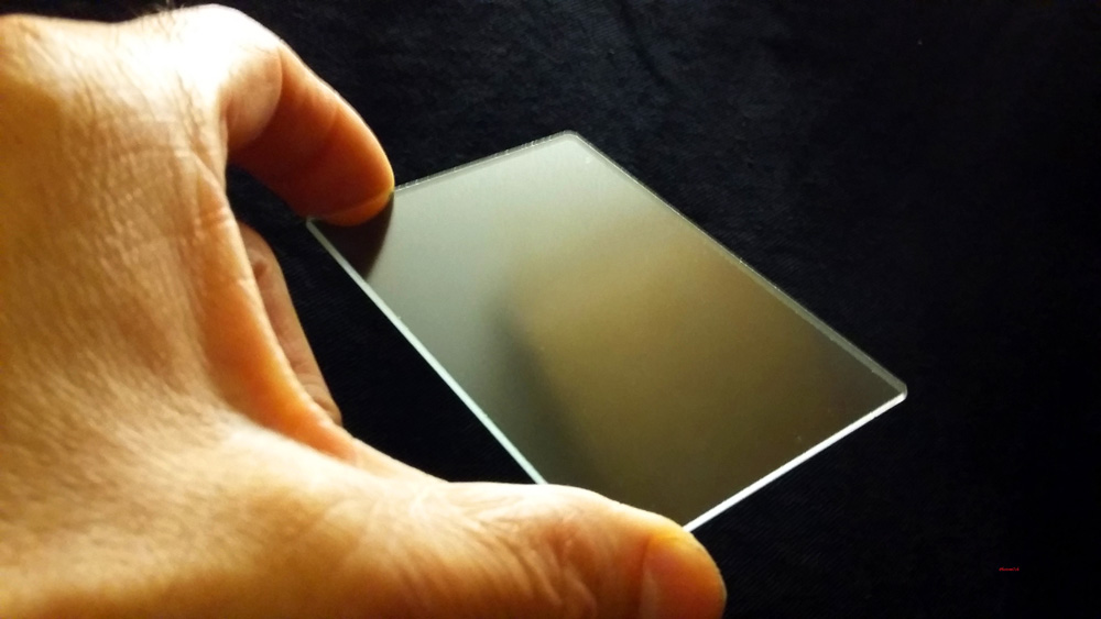
Pages

Showing posts with label darkroom. Show all posts

Sunday 28 January 2018

The photograph

The photograph is the positive result of a long journey from making the negative to the print. Once you get to the point of printing it starts another odyssey of creativity, along with another set of decisions as to what materials you are going use to produce those wonderful photographs.

Recently a photographer said he only uses the materials of his chosen manufacture to produces his images. His position is they know best so why make things difficult by using different products. At one time I was the same using paired paper and developer to produce prints. But with the death my father I'm questioning this approach; it has made me seriously think about the materials I choose to use. Why? Because life's too short for such restrictions and I've started to believe that the choice of materials you choose to use has a direct impact on the look of the final image and therefore it's style.

In today’s world of analogue photography there is not the vast array of papers there used to be. Light sensitive papers fall into three tonal types: neutral, cold and warm and come as resin coated and fibre base with a number of different finishes. Now-a-days the main stream papers are variable grade meaning you no longer need to stock a number of set grades of each type of paper you prefer to use. This has given greater freedom to stock a number of manufacturers paper types. For example I have stocks of Ilford, Foma, and Adox on the shelf in warm, cold and neutral tones. This has given greater creative latitude when it comes to exposing negatives, this has lead to less stringent light meter readings and less time trying to make the conditions fit the grades of your printing stock. I have in the past used a particular developer for my prints so it conveys a feeling on the subconscious level, for example, adding warmth when in fact the scene is cold. Is this not part of the creative process? For some it would seem not.

Analogue photography is all about the photograph. If you do not hand print your pictures you are missing out.

Accompanying pictures: 

All images scanned from photographs. The papers used in order of appearance, Kentmere VC select RC gloss, Ilford Multigrade 4 RC gloss, Fotospeed RC gloss, Foma 542 chamois FB gloss. 

Since writing this the wonderful Foma chamois has been discontinued.


Friday 12 January 2018

Newton's rings. Updated


This effect can happen when using medium format and larger negative carriers as they use glass to keep the negative flat. Most carriers today use a frosted piece of glass above the negative known as anti Newton glass. 
The rings occur in the areas where two clear smooth flat pieces of glass lie next to each other but do not quite touch. The interference happens because the light rays are refracted, this produces irregular shaped dark rings in the projected image. This will happen more readily if any of the surfaces are wet. You can get round this by using a paper mask with the negative in the carrier. This will block out the light in the places where there is a gap between the glass surfaces. You will need to check the projected image to see if they are still visible.

Sunday 26 March 2017

Enlarging lens revisited

Recently black and white photography magazine has been celebrating it's two hundredth edition which gave me impetus to rediscover what was in some of those back issues. While thumbing through one issue, an article about enlarging lenses caught my eye, reminding me that I have been meaning to revisit the subject.

I have written a couple of small articles: Enlarging lens and which aperture  I re-read both before writing this one so as not to repeat myself. But that is not going to be easy as the main issue with enlarging lenses is quality. The rule of thumb is to choose a lens of six or more elements. The Componon-s and Rodagon are two modern designs that work very well - they are two quality makes of the few still available new.

Looking down a focus finder at F5.6- F8
In the 1970s Nikon special optics division set about producing a darkroom lens second to none ( Apo-EL-Nikkors ). It was done in a one off batch, releasing a number to the market over a ten year period until they were all gone. It has been said that at the end of this period they did consider doing another run but stopped doing so because they would have had to sell the lenses for £12,000 each. I do not know if this figure is true or not. If it is, it will have made the original runs price in the thousands and therefore out of the reach for most of us.

The enlarging lens has one job to do and that is to project the the image from the negative to the paper perfectly. The one hindrance to good enlargement method and creativity is poorly maintained or ignorantly used enlarging lens practice. It is not good enough to think if you close the lens right down, like you would a camera lens, that you will increase the sharpness of the image. The rule again is to close the lens down by two F numbers. In a lot of cases this produces the optimum sharpness. One stop more may result in a softening of the grain structure. This does not mean that you will notice a softening of sharpness with the mark one eye ball as the image is projected onto the paper. Like a lot of things in photography the kit is made to a greater quality than can be seen in normal life.

Focus finder
Enlarging lenses should not be treated as second class citizens as they are several time better in quality than the camera mounted counterparts. They do their best work in a very narrow range of magnifications. For 35mm negatives the lens is optimized to 10x its size which equates to an enlargement of 10x8. As you go up the format scale this decreases 6x6cm lenses 6x and 5x4in 4x magnification. As you push past the optimal point it increases the possibility's of grainy photographs. This is not to say you should not push beyond this point as experience has shown. You can negate this by using ultrafine film developers.

Grain at f11

How do you see which is the best apertures to use? You need to complement your lens with a good focus finder. This magnifies the grain of the negative so you can see it. The best way to use the finder is to have the enlarging lens fully open. Place the finder in the middle of the baseboard. While looking down it at the grain, adjusting the bellows until it separates into little defined specks. This will mean that you now have fine focus.

While still looking down the finder shut the lens down a stop at a time. There will be a point where the look of the grain go's slightly soft and becomes softer the more you close it down. You should remember that you are still at optimum focus. To test this you can try to adjust the sharpness in most cases it will get worse and become to difficult to regain any sharpness until you go back to the optimum aperture.

Grain at F16 looking down the focus finder.

What has been described above is my experience with one of my 35mm enlarging lens. I will point out that it is not a well known make. It is one I use often. The softening of the grain in the focus finder is not transferred to a softer looking image on the baseboard that can be detected with the naked eye but you will start to question whether it is affecting the quality of your images. The only way you will know is to borrow or buy a better quality lens and do a comparison.

When considering buying a lens you should spend as much as possible to ensure that you get a good to very good lens. Knowledge that the lens is not what you expected will impact on your photography subconsciously.  

Friday 17 February 2017

Double grade printing.


From time to time I find it strange the way events come together! for instance, I was in the darkroom working on some prints that I could not get the sky to burn in properly. There was nothing unusual in me burning in the sky, most of the photographs I produce have had the skies enhanced in some way. But this time I could not get it the way I wanted it.


The strangeness in this case was that a few days before, I was reading a thread on my favourite forum about how to deal with whited out skies when printing. I took part giving an account of my method of dealing with it. One of the other contributors suggested split grade printing. But when he described the process it is more akin to double grade printing - this is where you use another grade to bring out part of the image that will not burn in at the grade you are using.


All the circled images needed double grade printing.

The process:


The contact print in this case suggested that the stone work of the building and sky were under exposed when compared to the reflection. The segmented test print (grade 2) proved this by indicating that it may need to be burned in for an extra twenty seconds above base exposure of thirty seven seconds. Even with the extra light it did not make the difference. After a further print and forty seconds burn in, it still was not right. I decided to see if changing to a harder grade when burning in would make the difference.

With the discussion still fresh in my mind I opted to use the double grade method to see if it would solve the problem I was having. I normally would have used pre flashed paper but that would mean starting all over again with a pre-flashed test strip. I chose the simpler route of dialing in a harder grade, in this case 4, before burning in the sky and face of the building.

The red area indicates the over lap area of the mask.
Something to consider:

When using this method certain negatives can produce a grainier look to the picture which may not be to your liking and you need to be careful not to knock the masking frame when changing the settings and using the mask.

The burning in method:

It takes practice to get this method to look natural, which is easy to master when you have a nice defined area without things like buildings poking up above the horizon. A piece of card is needed to use as a mask. You do not need to use black card but if you have some all well and good. Otherwise any card will do, if one side is brighter than the other you should always make that side face the lens to reflect the light back. In my opinion you should make the mask smaller than the site that needs covering. Because the card is kept moving it will make up for the under size when used with an up and down motion. If you don't you can end up with a lighter shaded area a bit like an out line you would get if it was still. When you get it right it is very satisfying.

 Result:

I used forty seconds at grade four to burn in the building and sky. How did I know it would work? I further considered the segmented test print, took a calculated risk and listened to the little voice in the back of my head. In other words I went with the creative flow.


Basic outline for split grade printing.

Monday 23 January 2017

Welcome to the New Year

 On a grey and dull day I am going to say a big, bright THANK YOU to all my follows, subscribers and supports for visiting the blog over this last year. Views are up big time even though it has been a bad year personally.

As is the custom for this time of year I have a new header picture that shows a hand picking up or putting down an Agfa Isolette I will leave it up to you how you interpret my intent. If any of you have any suggestion please share your thoughts.

As I sit here writing this, it is peeing down with rain, which has inspired me to set up my pinhole camera to make an image that will take eighteen minutes to expose. Not the longest exposure I have made but getting there. This is  the start of my rediscovery of the wonders of  pinhole photography and the Zero camera in   articular which I hope to use more this year  instead of leaving it in the camera bag. A new   years resolution of sorts!

Talking of new year resolutions photograph wise -  have you set any? I don't as a rule but this  year is  going to be different I have two things I  could like  to achieve one I have already  mentioned the  other is to spend more time in the darkroom  printing, something that I can neglect. I find it  difficult to spend anytime at all during the  summer months in the darkroom I  o not like  wasting time inside if the weather is  bright and  warm, even in the evenings. I  suspect I'm not the  only one. What are your thoughts? 


I'm looking forward to seeing you all again this year. Don't be shy if you drop by - have a chat (leave a comment) - always interested in what you get up to. I shall leave you now as my mistress the darkroom is calling! I will chat with you all again later. Before I leave I would like to wish you all the best for the year ahead. 

Saturday 10 December 2016

What can Contact prints tell you.

I have written on this subject before outlining the advantages of making a contact print for your negatives. The subject has come to the fore because a recent example shows that the negatives are poorly exposed and possibly have a higher than normal amount of contrast.


 So where to start? With the sheet of negatives. The first thing you notice about them is that they are well developed with good tone and detail but on the dense side, meaning they could be over exposed / developed. Something that can sometimes be difficult to judge from the neg's only.
 
The contact print is saying that the negatives are well and truly over exposed and or over developed meaning that to get a balanced image is going to require a longer than normal exposure. It is also suggesting that the images are hard (a lot of contrast) How much will not become apparent until the segmented test print has been produced.


My normal exposure set up for the enlarger is F8 at grade 3 this is my datum point to which I judge how well I have exposed and developed the film. The first test print confirms that the negatives are very over exposed, requiring a second test because the results are so weak. I must admit that I was a bit blasé with my pinhole camera exposure times. This camera tends to bring the worst out in me when it comes to proper control but then it is all part of the fun.


I have already compensated for the longer exposure time by opening up the enlarging lens to F5.6 doubling the amount of light I would usually need. I also know that the contrast is higher than normal from a previous set of exposed photographs. It is to do with the Studional I used to develop the negatives in. A previous session showed that the softer grade 2 would give better results.


Without the contact print I would have spent much longer in the darkroom making test prints to find what the base exposure should be, if I had not been pre warned. It also indicated that the completely white looking skies would require a lot of burning in to bring the detail out shown on the negatives.


For me making a contact print ensures that I get the most out of my printing session. It allows me to preplan what I need to do to get the best out of each negative without wasting a lot paper and time. The later for me is always in short supply.


Technical data:

Zero pinhole multi format 120, tripod used, Film Fomapan 100, ISO 100, Developed in Studional, Printed on Ilford multigrade gloss RC 8 x 10, Developed in Tetenal Eukobrom 
AC.


Unintended double exposure.


Saturday 3 December 2016

Freestyle printing session


I don't know about you but sometimes I find the constraint of having to make a segmented test print to determine the right exposure for each negative tiresome. I sometimes feel that it interferes with the creative process. On these occasion in the darkroom I put myself to the test with what I call free printing. I can see some of you shaking your heads at such a notion. It is a way of pushing your instincts creatively. 

Let me lay out the rules of this creative freedom. I pick a random sleeve of negatives, run my eye over them to see what catches my attention. Load that negative into the enlarger and then make a half sheet test strip at five second intervals. This will be the only test strip of the session providing the starting point for each subsequent negative I opt to print. I give myself two attempts at getting the exposure right using my experience and knowledge (best guess) to refine it with dodging and burning. This is where your print technique is put to the test and your ability to choose negatives of the same density.
First print.
 

Into the darkroom. I have chosen a set of 35mm negatives that have a selection of landscapes I made while I was in the lake district and the one that took my eye was looking across the lake into the sun. As gooder place as any to start the printing session.


After adjustments

With this negative loaded I set up the enlarger as follows: the lens to F8 and the paper grade to three. These are the most common settings I use when printing. The paper used is silverproof matt. With the test strip made I look carefully at it to work out the overall exposure and how much more light may or may not be needed for a balanced print. 


The mountain into the sun image is the one I made the test strip for. Even so it proved difficult to get right. I chose to print overall at 32 seconds adding an extra 15 secs for the sky. This did not allow for the mountain slops on the left of the picture which needed less light to stop them completely blocking out. The burning in of the sky did not take into account the brighter area to the center right leaving it a bit blown out. So for the second print the mountain slops to the left were held back for -7 secs and the off center sky received a further +15 secs.

Before adjustments

After adjustments


The second negative chosen was the fence post into the sun. I already knew that overall this would require less light to print, the trick here would be by how much, after a bit of consideration I opted for 27 secs. Which worked well but I felt it needed even less. Overall the second print was exposed for 24.5 secs with an added 5 secs for the sky. Not much of a change, but the affect on the foreground was positive.


Before

After

Right first time no adjustments


The third negative is of the dog in the lake. I chose 25 seconds for this because the negative looked a bit dark indicating some over exposure. I was too bold with my exposure time as the print is a bit washed out with no sky. So I up it to 28 secs and added +28 for the sky. In cases where the sky is whited out I double the amount of light when burning in. Overall a much better picture.


The final image looking through the trees is a straight print, the overall time is 27 seconds. I'm happy with the print, yes I could adjust a couple of bits, but they would not add much to the overall look.

Free flow printing sessions are not always successful but it does free my mind especially if I'm having a bad time getting a picture the way I want it. 

Sunday 6 November 2016

Studional first use.

Negatives developed
in Studional.
The darkroom is beckoning again, with the death of my father the will or the inclination to do anything connected with film photography has been at a stand still. It is as though my creative energy has been knocked out of me. It was the childhood wonder I had in his fold out camera that peaked my interest in photography in the first place. Spurred on with the little camera he then gave me. Which was later given away.


The darkroom has suffered with my long absence. It is a dusty dirty hole in need of some maintenance. I have also neglected to replace used up materials: film developers, photo papers etc. etc. It has taken time getting things back into shape, for now I will have to make do with what I've got materials wise. Which just happens to be a fresh bottle of Studional.


This is A&Os formulation of the once dead developer. It is advertised as a fine grain, clean working general developer - that can be used in deep tanks?? - or single use. I have interpreted deep tank to mean batch development where a number of film can be processed from a single batch of diluted developer. It suggests dilutions of 1+15 to 1+30 for one shot use. So I am assuming the same for batch production.

Grain pattern produced by Studional on FP4+.
The colour cast represents printing grade three.

I have been told that this developer is akin to RO9s and can be treated in the same way. This is the first time I have used it so I will do as suggested - which is not my usual way of working - I tend to do what my instincts tell me; I must still be out of sorts!!


I have a number of rolls of 120 FP4+ and 35mm Fomapan 400 to process. Checking through the dilution chart it suggests a dilution for the above films as being 1+15 with a developing times of 3.5 and 6 minutes for the Foma. (Digital truths dev chart is a good place to go for dilutions and times.)


I have made up a litre of the developer at 1+15 and intend to use it as though it was RO9s that means on the day of dilution you can process 12 film of mixed formats in a litre with no time compensation. The developer is good for three months with compensation factors for how long the developer has been stored diluted. (Adjustments: 1-3 days 5%, 4-8 days 10%, 1-2 weeks 15%, 2 weeks to 3 months 20%.) I know it sounds a bit flaky but true, I have already tested this with RO9s so I know it works, with no degradation in the quality of the negatives. Like RO9s you will need to protect you hands when using it. It has a caustic bite, this is the second developer that I have experienced this with.


On the day of dilution I processed four films: Two FP4+ and two Fomapan 400 both were exposed at box speed. I developed the Foma for the suggested time and the FP4+ at 4 minutes. Using my standard agitation method: 12 inversion in the first min and then 4 each min after that. Short developing times like that of FP4+ always makes me feel there is something missing. I think it is because I'm used to using longer times. The results are clean and crisp with a good tonal separation. They also look to have more contrast than what I'm used to.

I didn't know at the time of making up the developer that it would take a month till I would use it again. This time with a couple of rolls of 120 FP4+ and Foma 100. In this case I added the 20% compensation. After the first set of neg's had been processed I checked them. No change in the tone or quality which was good news for those that followed. In all, the developer produced ten good sets of negatives before the three month suggested time period was up, without any noticeable changes to contrast etc.


I have contact printed all of the film processed in the Studional. Out of the hundred and seventy negatives only a couple show signs of air bells (bubble marks) which is not bad, I have experienced a lot worse. The contact prints were made on Ilford multigrade RC gloss, developed in Tetanal new Eukobrom AC.

Having printed some of the individual negatives I can confirm that there is an increase in contrast and that it has a fine grain structure. It has helped to produce some finely toned photographs. It has also helped me regain some of my creative spark that has been missing over the months. I cannot say the same for writing these articles I am still finding it difficult to get started.


Technical Data:

Bronica SQAi Hand held, Film FP4+ @ 125 ISO. Box speed, 120 format 6x6 negative, Printed on Ilford Multigrade gloss RC 10 x 8 @ grade 2 developed in Tetanal Eukobrom AC.


Wednesday 30 December 2015

Oh for the grain.

It is a fact of life for film users, if it was not for the those tiny light sensitive particles we would not have some of the world greatest pictures. All the same overly grainy negatives are a pain if you have not planned for it to happen it's a big let down. You must not forget that it is not all about the journey it is about the results as well and what looks like rubbish to you now. Maybe an inspired choice to others.
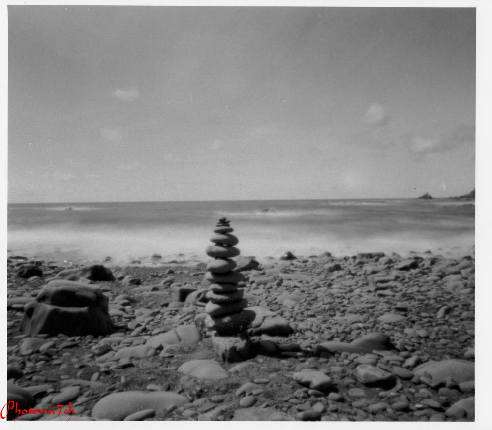
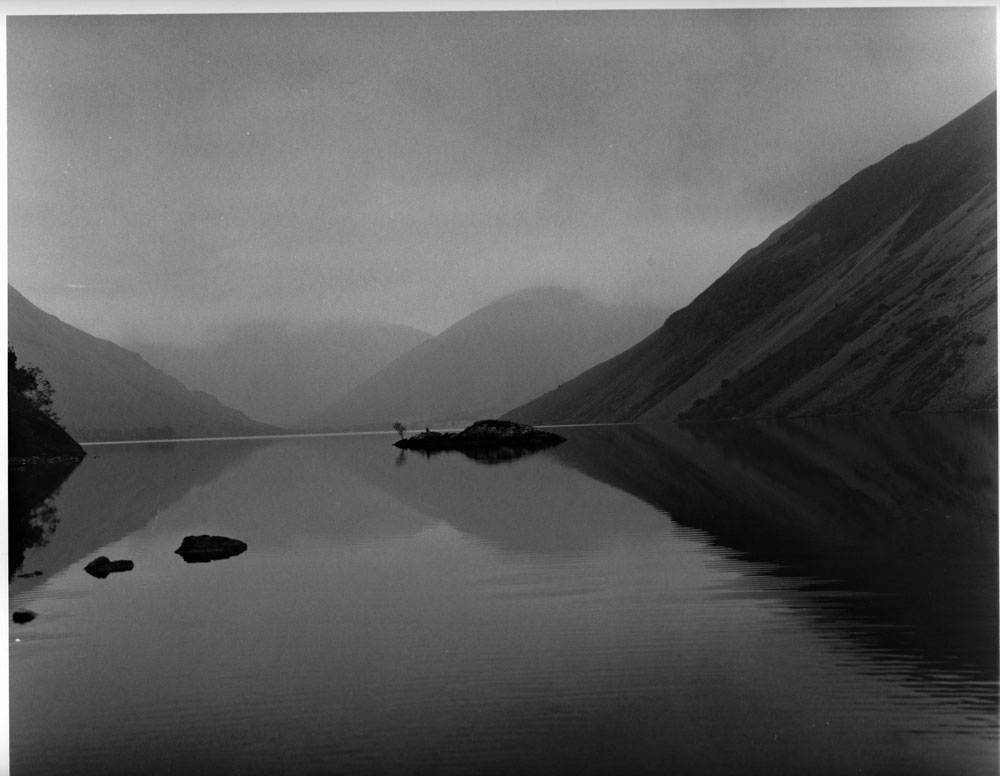
The fact you have a negative to look at is a result and something that will print and or scan. At one time grainy pictures were all the rage. Producing some wonderfully expressive images. Admittedly they are not everyone's cup of tea. In other words keep an open mind.


The object of developer is to bring out the latent image held in the emulsion. This is achieved by a chemical reaction, acting on the silver, producing dark areas where it is light and bright areas where there is shadow. The negative is reversed later with the print. There are three important things to keep at the front of your mind are: the development time, the temperature and dilution. It is these three factors that ensure the ultimate image quality when it comes to printing. Too short a development time will produce too thin a negative, like wise too long a process time will make the negative too dense, leading to very short and very long print times respectively.

Agitation is important as well and one of the most over looked parts of the film development, it can in some cases make the difference in how well your negatives turn out. As the developer interacts with the emulsion of the film, it vigorously attacks the silver it comes into contact with and becomes exhausted. By inverting the tank you refresh this action, producing evenly developed negatives. It is important to get this right. To little agitation will allow by-products of the process to build up, leaving pale-toned streamers as they slide to the bottom of the film. Likewise excessive inversions will produce currents in the developer, creating uneven development. Most process times allow for agitation.

Developers:

The first thing to look at is the developer. This has the most influence over how your negatives will look. Before you settle on one in particular make sure you understand its attributes. On a practical note you also need to know how often you will process a film. If you are going to process a film every week or so then it may be better to use one in powder form like ID11 or D76. Or a one shot liquid for occasional use, like Ilfotec HC or Kodak HC110. I have suggested these developers because they are main stream fine grain developers. RO9 is not recognized as a fine grain.

For example:

Ilford ID11: A full speed developer with fine grain. Supplied as a two pack powder. Down side is that you have to make up 5 liters of stock solution. This then leads to question over it's keeping qualities. ( I have taken a year to use a 5ltr batch without any loss of quality) It can be used as one shot or multi use with allowance for depletion. ( I have only ever used as a one shot.)

Ilfords Ilfotec HC: A highly concentrated, fine grain liquid developer. It is suggested that this is the liquid equivalent to ID11.

Kodak D76: Fine grain developer recognized as Kodak's ID11. It has been reformulated as a one pack powder. The down side is that it needs very hot water to mix it easily.

Kodak HC 110: A fine grain sharp working developer. In a highly concentrated liquid syrup form. This is Kodak's answer to ID11/D76 as a liquid.

One more developer to what could be a very long list and that is:

RO9 Special/ Studional. These are the finer bred brothers of RO9 and Rodinal. They are very concentrated liquids with the good keeping qualities you would expect from this family. 

The unexpected.

It is the developer you choose that has the most influence over what your negatives and grain looks like. Inter mixed with the way you apply the agitation method you adopt and making sure that the temperature is right. Master this and the rest will fall into place. Yes you will make mistakes we all do even with years and years of experience it is all part of the rich tapestry of processing. It is and can be a pain when the results effect that special set of negatives. I know, it's that spanner that has landed with a big thud at times. The trick is understanding what went wrong, then put it right and move on. Now a days there is no such thing as a bad set of negatives - just conceptually challenging. You just have to look at all the apps you can get now that put back all things analogue photographers try to avoid. So what maybe unacceptable at first will change over time.

Really what I'm saying is to keep an open mind, the analogue process can, if you embrace it, give an unexpected creative lift to your images. Which today is more acceptable than it used to be. 


Friday 25 December 2015

Looks like coffee not multigrade?

Ilford multigrade paper developer
It has been sometime since I have entered the orange light district. Upon entering recently the darkroom looked a mess, something I don't remember leaving.! It could do with a good clear out and clean up but that will have to wait. I'm in desperate need of print therapy. I do a quick clean of the enlarging easel and lens. Then check the chemicals in the paper processor.

 The developer has gone a very deep brown, the stop and the fix look OK they were all fresh the last time. Even so I change the fix. Now what to do about the dev? In the end I emptied out half so I could refill it with fresh. Your thinking 'it's knackered why bother?' but I prefer the tone you get when fresh and old are mixed together. The slight depletion gives a warmth to images I like.

Contact prints.
I opened a partly used bottle of Ilford multigrade and poured out some of the contents to be met by a liquid the colour of black coffee! That's a new one on me never had that before! Which makes me think - ( expletive ) Mmmm! I'll use it anyway see what happens. I do not have a choice as I do not have a fresh bottle on the shelf.


First test print
It was my intention to get on with some enlargements, but I decide to contact print three sets of freshly developed 35mm negatives as this will test the strength of the developer. It turns out that the dev is more depleted than I had expected ( you were right). The contacts are taking nearly two minutes to reach full development and that is a very long time for resin coated paper, which is usually fully done in a minute.

Before I start work on the enlargements I drain another litre of developer and add some more 'black coffee' (developer) to the mix. Then load the first negative into the enlarger. I find I can be a little apprehensive getting ready to do my first print after a long absence. I'm not sure why, as it always works well.  

Second test print

With the first test strip exposed, into the dev it goes. Ah! I was a little quick off the mark the developer has not reached 20C yet as it takes a little over a minute to fully develop. As it turn out the test strip shows that I was being optimistic with the F8 aperture I had set. The test strip is not showing any exposure in the first four, five second segments. Indicating it will take more than fifty seconds to reach a base exposure time. That's far to long so, I adjust it to F5.6 effectively doubling the light. The next test strip I start at fifteen second and go on from there at five second intervals. Sometimes I can over develop the negatives and this is the first indication of it. Which I don't mind. The trick is not to over do it as it leads to loss of detail. That's better! the test strip was fully developed in less than a minute.

How the areas were dodged showing
how much extra light was added to each
section

With the second test strip in the holding try I take my time looking at the segments. My vision for the image has already formed and with a plan. All I need now is get off the fence and decide what time the first print should be exposed at. I plump for twenty two seconds at F5.6 at grade three on Kentmere RC gloss 9x12. I have already noted that the Ro9s negatives are a little softer than the normal Ro9 and not as grainy.

I need to point out here that I always work from wet test strips and automatically add a dry down factor without thinking. Ansel Adams used to tell a story of how he came to recommend that you should always work from dry test strips and prints. He had produced a particular photograph that was a delight to the eye so much so that he went ahead and printed a large number of them. Only to throw the whole lot out the following day as they did not look as good as when they were wet. I don't very often do long print runs and if I do it is not until I have studied the print dry in day light.

Final print.

As I look at the photograph in the holding tray with the rooms light on I can see it is over exposed, dull and muddy looking. It lacks the luminosity I have come to expert from analogy prints.

I already new that the picture would need dodging to recreate my vision. I inspected the test strip again and cut the overall exposure time to fifteen seconds. I then dodged the foreshore and wooden posts while I added a further seven seconds to the water above them and the sky.

 
Again I studied the second print in the holding try. Although it had improved, It still fell short of my vision. It is a good idea to have a notebook to hand in the darkroom so you can keep track of the adjustments. I have now cut the overall exposure to eleven seconds. I will add a further seventeen seconds in three sections. First of all I will add four sec's from the edge of the water to the rest of the picture. Next, seven sec's from where the wooden posts finish and finally seven more seconds to the upper part of the sky.


These last adjustment have improved the image no end. Bringing it very close to what I had in mind and giving it the luminosity it lacked. There maybe some fine tuning needed when I print it on FB paper but I will only do that once the photograph is fully dry.
With the three prints side by side
You can see how the image has changed.

The coffee coloured developer has worked well even with the heavy oxidation of liquid. A change in colour does not always mean it has lost it's potency. Now that the photograph is dry the image has a very gentle warmth to it. I have found that the tone a photograph takes is more pronounced once it is fully dry.