|
| Top grade Zero Bottom grade five |
The
use of split grade printing has changed the way I work in the
darkroom. Yes it takes a little bit longer having to produce two
test prints, but in the long run it cuts down the amount of dodging
and burning needed to achieve a finely toned photograph. I have also
noticed a luminosity that has been missing from my graded prints. It
has also shown me that it is an advantage and not a waste of paper to
make full or half page test strips. You get a better understanding of
how much more light is needed for the high lights, so you can build
this into the first full print of the scene. This saves time and
paper having to reprint it again and again to get it right.
I
find that my more contrasty negatives are more easily printed using
the split grade method, giving more control of not just the tones but
also the contrast. Burning or dodging my prints has been reduced
considerably, allowing me to add more detail at the extremes.
So
at what point should you be burning in or dodging? The grade zero
exposure being the most important one is also the stage at which you
should be making your adjustments. If possible you should be
including them for the grade five test strip. By doing this you will
have a better understanding of how the contrast affects the
corrections and make allowances for them in the final print.
Some
of you reading this will be thinking it's all to complicated and not
for you, Dodging and burning is about having confidence in your
ability, once you have done it and seen how it changes your pictures
for the better, you will be wanting to do it every time. I enjoy this
part of the picture making process, it always reminds me of a
composer on the rostrum encouraging certain section of the orchestra
to bring out his interpretation. Only you are using light to enhance
what you had in your minds eye.
 |
| Burning in graduation times |
OK
I'm going to keep this simple just to give you the idea of what to
do. I have only used grades 0 and 5 but in certain cases other
grades maybe more appropriate but that is for another time.
Producing
the prints:
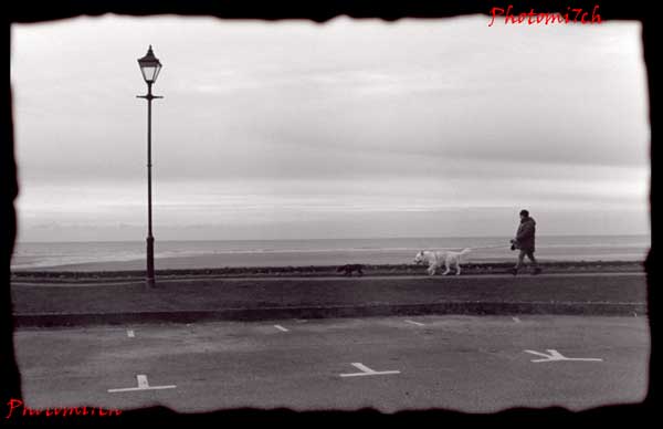
I
produced a soft toned (grade 0) test print at five second intervals.
When it was dry I compared the segments to determine which would
give the best overall toned exposure and how much extra light would
be needed for the sky. I chose seven seconds for the whole picture,
this allowed the street scene shadow to keep its detail without it
blocking out. A further twenty one seconds would be added to the sky.
With the main exposure done the sky was burned in. For this I used
two black pieces of card held together to form a V shape. The trick
with dodging (holding back the light) or burning (adding light) is to
keep the mask moving otherwise a hard line will be left. I gently
moved the card backwards and forwards lingering in places to give the
sky a graduated look. The times on the picture are there as a guide.
Now
I placed some black card over the masking frame to protect the
picture from any stray light, while I adjust the enlarger to grade 5
for the contrast exposure. The first segment was covered and then
exposed at two second intervals there after. Again when dry I chose 3
seconds.
 |
| Final print |
With
the all the times combined a full print was made. There are some
short comings; firstly the build on the left could do with a bit more
burning in to bring out the texture of the wall and if I wanted to be
really picky the sky could do with masking in more precisely which
would mean cutting a mask that mirrored the buildings outline.
The
idea was to keep it simple and to show what could be achieved with
the most rudimentary of masking off.